Think of your website as a highway. A pool of cars going at different speeds towards their own destinations.
When the road is smooth, drivers barely notice it. However, once they hit a bump, they get frustrated and might choose another highway the next time they travel. In the worst-case scenario, they will take the nearest exit.
Online shoppers are like drivers. They are quick to notice any dips in the road of your website and their journey can be full of “bumps”. A slow load time, unclear navigation and poor functionality — would steer consumers away from your business. And mobile shoppers would be the first to quit your website if it offers a bad user experience.
Why Mobile UX Is Important?
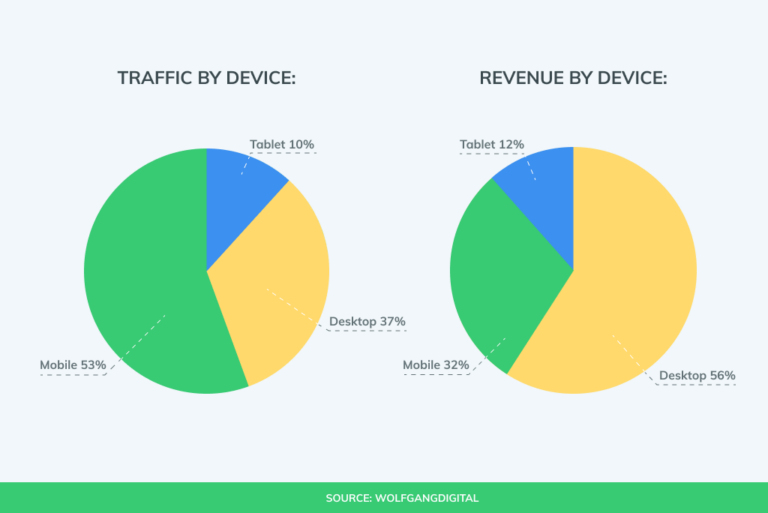
Mobile accounts for half of the total web traffic. Consumers continue to browse for products on their smartphones. Online stores strive to reap the benefits of the high mobile traffic: they create responsive web designs, develop fully-fledged hybrid or native apps.
But numbers show that few companies succeed in their approach to mobile marketing. With more traffic coming from cell phones, desktop is still the main source of revenue for retailers.
That’s how mobile becomes both the starting and the end point of the consumer journey. While people often start browsing for products using mobile, they rarely end up placing an order. A Google research showed that 70% of mobile shoppers do not finish a purchase due to a frustrating and difficult experience. So a good UX could well build the bridge to a continuous stream of untapped revenue.
What’s a PWA?
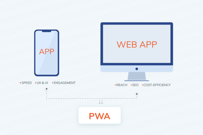
Progressive web app (or PWA) is a technology that enables businesses to develop websites that replicate the experience of a native app. It’s a solution that combines the best of both worlds: the backend of a website with the frontend of a mobile app.
Just like traditional websites, PWAs are indexed by Google crawlers and can be easily discoverable on the web. When users find a PWA website, they can add it to their home screen and use as it as a regular app. The quick navigation, smooth scrolling and fast load time — all contribute to a seamless shopping experience.
So how does PWA actually help mobile users? We have asked GoMage experts at PWA Storefront and they prepared a list of 10 benefits.
Benefits of PWA for Mobile Users
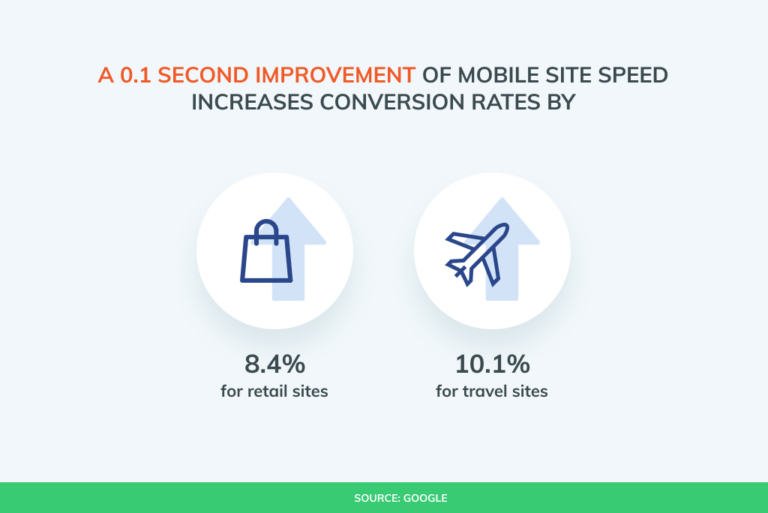
- Loads faster. The speed of PWA is faster both for mobile and desktop users. And the faster the performance of your website, the quicker consumers get where they want. The smart cache system saves users’ data each time they enter your store. So with every time users browse on your website, the shopping experience gets more streamlined and effortless.
- Easy checkout. Many mobile users drop carts due to the time consuming and inconvenient checkout. The PWA storefront allows your business to set up auto-complete, one-page checkout and one-click purchase features. Below you can see how GoMage PWA streamlines the sign-in process with Google or Facebook authentication.
- Add to Home Screen. Your regular customers can instantly add your store to their home screen. Unlike a standard bookmark, PWAs have a branded icon that can catch the user’s eye and match the design of other native apps on the menu. Last but not least — instead of searching each time in the browser, your store is always located one tap away from your customers.
- Smooth scroll. The user-friendly navigation eliminates the scrolling fatigue for mobile shoppers. Searching among a long list of products can become a long and tedious procedure. Thanks to a sticky menu, customers can quickly find what they’re looking for even if your store contains thousands of items.
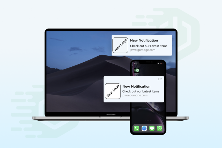
- Push notifications. Another advantage of PWA is the ability to send push notifications. Mobile users will be more engaged if they’re aware of special discounts, giveaways or other promotions. And those news stand a better chance of being seen with push notifications, as opposed to email newsletters.
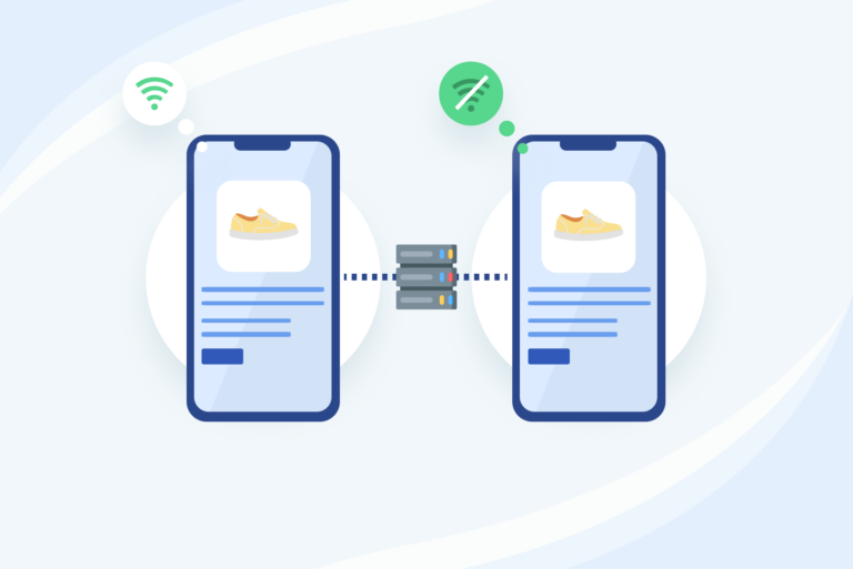
- Works offline. Mobile users often happen to be on the run with poor network connections and expensive data plans. The PWA cache system saves data on the phone and users can browse for your products even when offline.
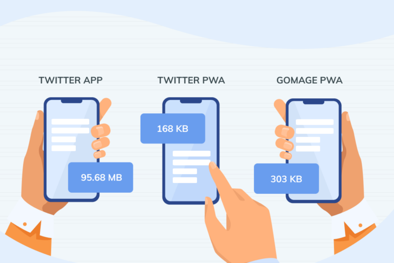
- Takes no storage. Unlike native apps, PWAs don’t take up much storage space. For instance, the Twitter app weighs 95.68 MB, as opposed to 168 KB of Twitter PWA. Mobile users are more likely to give your eCommerce store a chance, if it doesn’t make them delete their precious photos or videos, which is often the case with native apps.
- Boot screen. Also known as “launch” or “splash” screen. While watching the ever loading address bar during slow website speeds – PWA users can see your brand’s logo or slogan instead. This will keep your users engaged and prevent them from leaving your website at times of poor connections.
- No Footer. Copyright information, terms & conditions, or social media links are usually of no use to mobile shoppers. Moreover, this information sometimes takes too much space on small screen phones. That’s the main reason native apps don’t have footers and use this thumbnail space to insert a navigation bar. This method was successfully adopted in the PWA of an eCommerce giant, AliExpress.
Finish line
A good user experience is a well-paved road to a “Buy” button. If it’s clear, smooth and passable – your customers will arrive at where they want to go. Your job is to help them reach their destination and remove obstacles along the way.
The biggest sign of an eCommerce store success is when users don’t notice how well it’s performing. With native features of mobile apps and functionalities of a website, PWA will drive the value of your products home and deliver great results!

