Your eCommerce category pages are the backbone of your online store. They showcase your products and guide your customers to make purchases. But are your category pages optimized for maximum sales? In this article, we’ll explore eCommerce category page best practices and tell you how to create pages that convert.
From organizing your products to optimizing your page layout, we’ll share expert tips and winning strategies to help you elevate your online store and drive sales. So, let’s dive into the topic and unlock the full potential of your online business.
#1 Help customers easily select parent & child categories
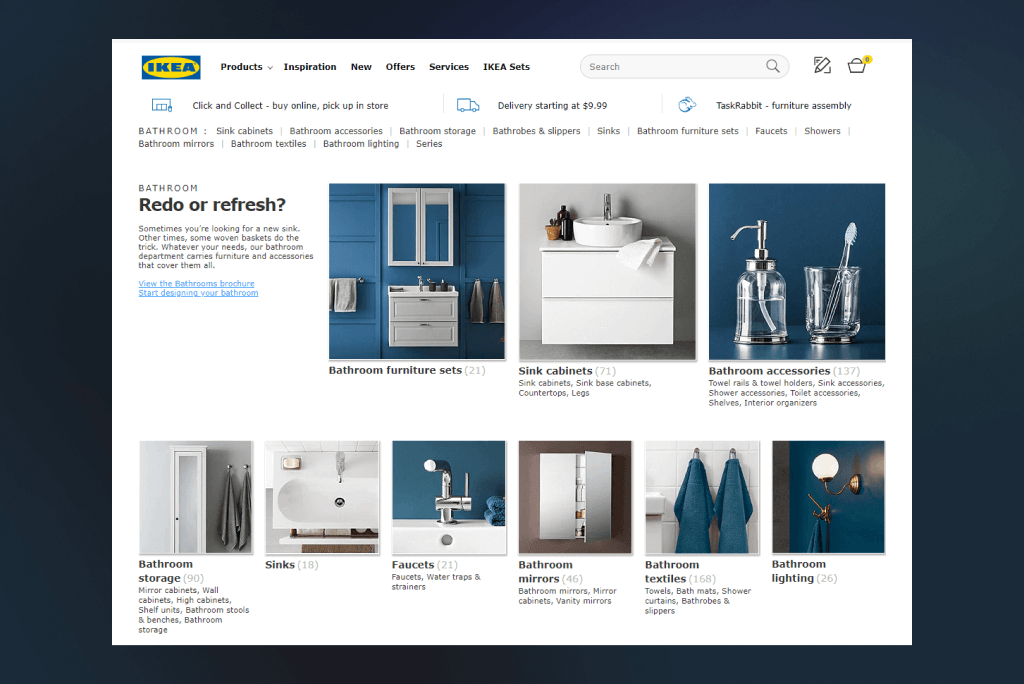
To ensure a positive eCommerce experience, it’s important to make parent and child categories equally selectable. By providing both category and subcategory pages, customers can browse and narrow their search for products. For instance, a customer shopping for dresses may not know what specific style they want, but can browse all dresses on a clickable “dress” category page. This encourages browsing, and customers can filter the results based on their preferences.
Without a high-level category page, customers may become frustrated and abandon the site before finding what they need.
#2 Use simple words for category & subcategory names
When naming your product categories, it’s important to choose clear, easy to understand, and simple language. Avoid using tech terms or industry jargon that regular people may not be familiar with. Instead, think of descriptive and straightforward category names that directly relate to the product.
For example, instead of using “RX Sunglasses”, which is a term commonly used by opticians, opt for “Prescription Sunglasses”, which is a term that your customers will likely get. Don’t try to be too creative, as overly complicated category names may confuse your customers and hinder sales.
Follow these two rules when deciding on your product category name: avoid adjectives as fillers, but use them when necessary to emphasize product features that increase appeal, such as “Free” or “New”. Additionally, keep your category names short and sweet, limiting them to one or two words maximum to make it easier for shoppers to scan through your eCommerce categories.
#3 Let shoppers compare products quickly
The average time visitors spend on a site is around 50 seconds. Well, 54, to be more precise. That’s less than a minute. So you have to let customers quickly and easily scan products and compare their images, prices, and customer reviews to make a purchase decision. Here are two helpful tips for you:
- Provide options to switch between grid and list layout
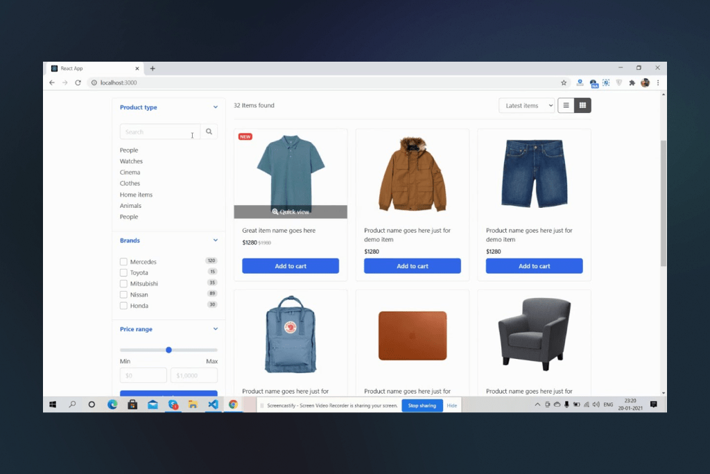
Giving customers the option to switch between a grid or list layout allows them to choose the most suitable option for their needs. The grid layout is ideal for displaying product images and providing visual differentiation, while the list layout is more practical for customers with specific requirements.
The list layout has ample room for text-based components like product titles, descriptions, and reviews, which aid customers in making an informed purchase decision. It is ideal for thorough inspection and performs better when there is a shortage of screen real estate. Permitting users to alternate between the two layouts constitutes excellent user experience and is a prevalent characteristic of top-performing eCommerce category pages, resulting in increased conversion rates.
- Offer a dedicated comparison option
To prevent customers from getting bogged down in excessive browsing and information gathering, it’s important to provide an easy way for them to obtain the necessary product details without having to navigate to different pages.
A click-and-compare option allows customers to compare goods based on various parameters such as materials, weight, reviews, dimensions,packaging features, technology, warranty, and more. Including video testimonials, interactive information icons, and dimensions (for hard goods categories) can further aid customers in making informed purchasing decisions.
#4 Use filters for easier browsing
Having too many products on your category page can be overwhelming and time-consuming for shoppers. To improve their browsing experience, consider implementing relevant and effective filtering options.
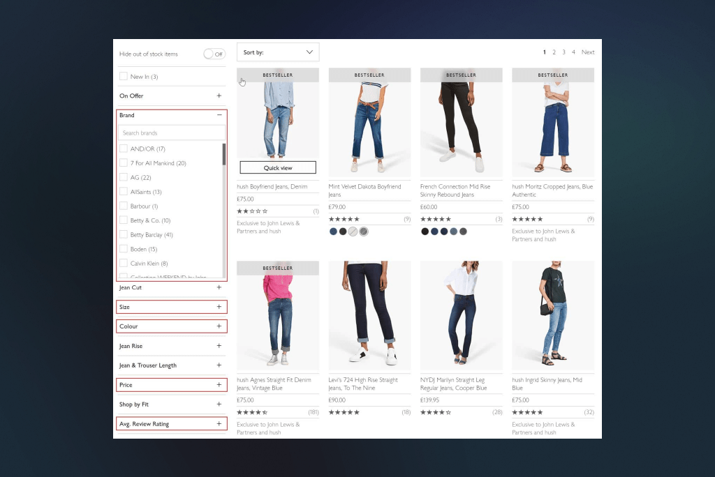
First, decide where to place your filter navigation. Experts recommend two viable options: left-hand navigation or a horizontal toolbar. While left-hand navigation is the traditional option, research has shown that customers tend to focus on the upper-center of the page (the so-called “tunnel vision”), which may lead them to overlook the filters. Using a noticeable filter design, such as checkboxes, can help overcome this issue.
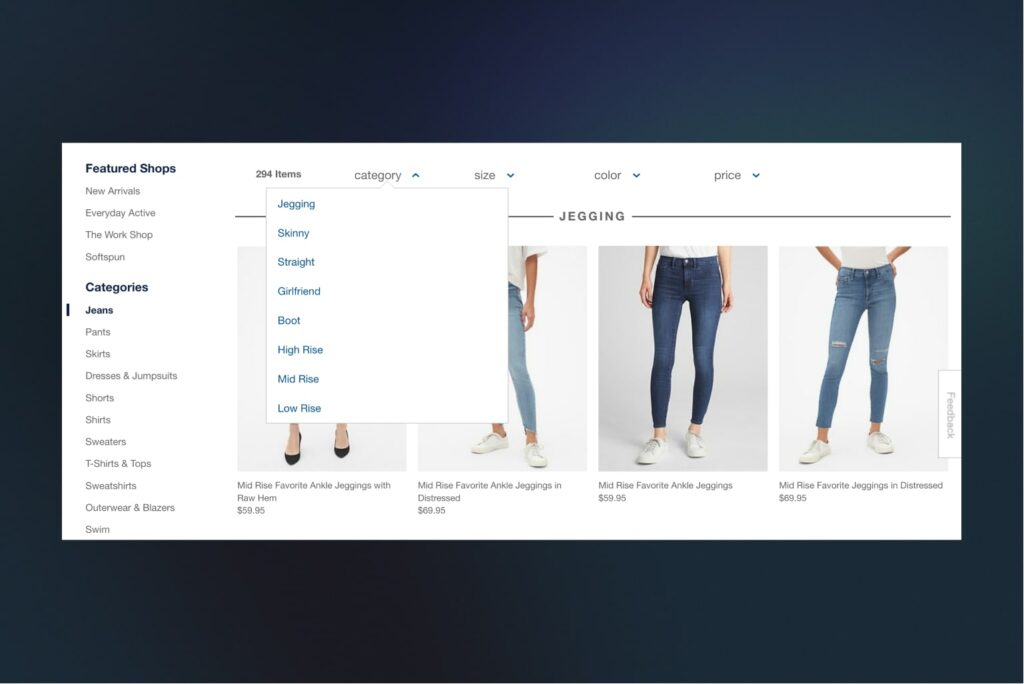
A horizontal toolbar is another option that features both filters and a sorting tool, making it easy to notice and allowing for larger product photos. However, this option is best suited for eCommerce stores that require only a few filters naturally.
Multiple filter layering is essential for providing a better shopping experience. Having several filtering methods allows customers to narrow down their search and find products that fit the bill to a T. It’s recommended to include specific filters that aren’t typically offered by other retailers. Temporary and time-based filters can also be helpful, as they allow customers to find products based on specific occasions or trends.
Ultimately, your filters should be located in the right place and designed to improve the customer’s shopping experience. By using effective filtering options, you can make your category page more appealing and convenient for shoppers.
#5 Simplify searching & embrace faceted navigation
Online shopping provides customers with the convenience of finding and receiving any product they desire at their doorstep. However, for ecommerce sellers, it’s not as simple as having a store and selling products. With stiff competition in the market, it’s essential to ensure that customers can find what they need quickly and easily on your site to stand out and boost sales.
And this is where faceted navigation comes in handy.
To simplify searching and navigation on your site, you can:
- Keep the search box big. The placement of elements on your category pages, including the search box, affects the customer experience. Make sure that the search box is big enough to accommodate long queries and double-checking for errors. This is particularly important for sites that sell products with long codes, such as electronics.
- Enable faceted navigation. Faceted navigation allows customers to search for specific products within certain sections, without displaying results from other category pages. By providing customers with filter options that allow them to refine their search, you can simplify their navigation and help them find what they’re looking for faster.
- Avoid duplicate product categories. Using duplicate category names can confuse customers, and it’s best to avoid them. If there are two or more subcategories with the same name, create a single category for overlapping subsections. Or you can use an alternative category name to sort products in a specific section.
By implementing these tips, you can improve your customer’s user experience, increase sales, and even score some serious SEO brownie points.
#6 Use breadcrumbs to simplify the shoppers’ journey
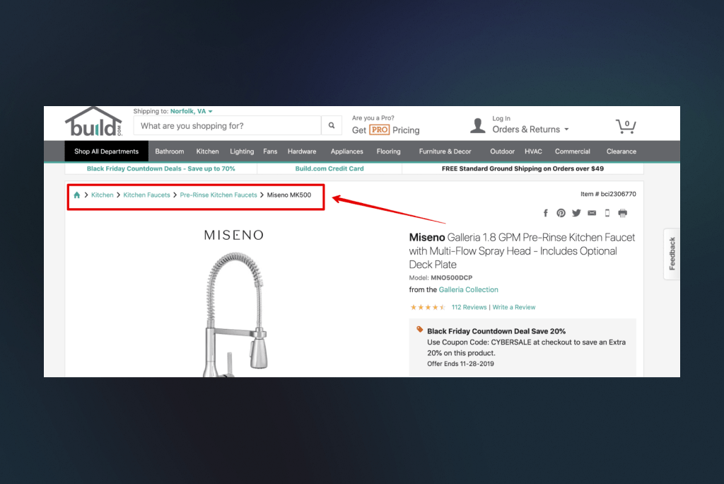
Empower your shoppers to take control of their navigation experiences with the help of breadcrumbs. Breadcrumbs are a secondary navigation scheme that displays users’ location on a website and their trail.
When browsing products, shoppers can easily get lost and may have to rely on the browser’s back button to find their way back. By incorporating breadcrumbs, you can simplify their navigation experience and let them retrace their steps more easily.
#7 Invest in high-quality optimized images
Product images play a significant role in captivating customers and driving purchase decisions. According to research, 87.6% of customers consider product imagery as a crucial element in the shopping experience.
Optimized images provide quick and relevant information about the product, showcasing its features and value in context. This helps customers make informed decisions and reduces eCommerce returns.
Dynamic images like animations and GIFs can effectively highlight the essential aspects of the product, increasing engagement levels compared to static images. Additionally, 360-degree images on eCommerce category pages have also been shown to increase conversion rates by 30% according to numerous studies on the web.
To sum up this point, here are two small pro tips from us:
- Ensure all the images are of the same size
- Limit the number on images in a row to 1 on mobile and 3-4 on desktop on a category page
Web Design Create a visually captivating and highly functional online store that drives conversions and sets you apart from the competition.
#8 Consider adding informative & catchy category descriptions
As a merchant, you should consider adding category descriptions to your online store. Shoppers who visit your category pages are often new to your store and may not be familiar with your products. By providing detailed information about your eCommerce categories, you can make their shopping experience less tedious and time-consuming. Category descriptions bridge any knowledge gap and help interested shoppers determine if scrolling through a specific category is worth their time. This can boost engagements and ultimately lead to increased sales.
#9 Enable product sorting to show relevant items
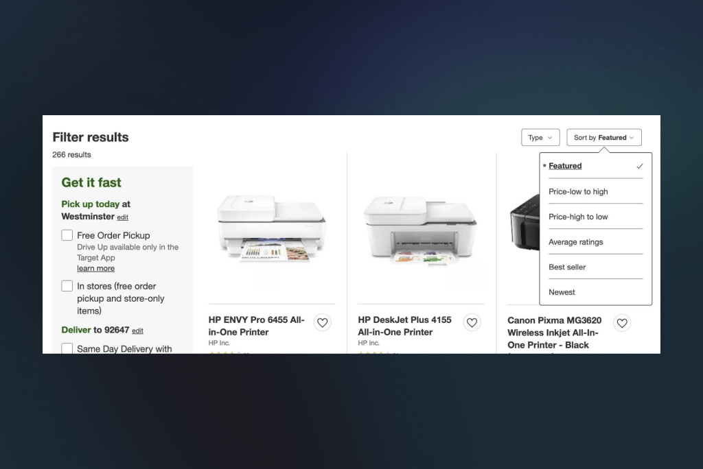
To help visitors find relevant products, implement product sorting to refine product searches and present products in a specific order based on user intent.
Sorting can be done by various criteria, such as price (high to low or low to high), by popularity, by review count, customer top rated, etc. Sorting by customer top rated is an effective option as it helps shoppers make informed decisions based on collective customer experiences, and reduces risk aversion.
The implementation of a “recommended for you” sorting option can leverage authority and persuasion principles, prompting customers to trust and follow the recommendations of credible experts. This feature utilizes personalized criteria like discounts, new colors, clearance, latest and popular products to offer a diverse and optimal set of suggestions.
Personalized recommendation sorting can induce new customer experiences and encourage purchases. According to research, 46% of US customers buy online because of customer reviews, yet only 36% of eCommerce websites offer customer rating sorting. Implementing these sorting options can give you a competitive advantage and boost customer confidence in making purchases.
#10 Offer personalized product recommendations
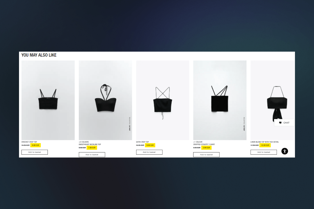
Display personalized product recommendations on your eCommerce platform by utilizing shoppers’ browsing history. Top eCommerce brands utilize behavioral data and employ artificial intelligence and machine learning algorithms to tailor product discovery to customers’ needs, resulting in quicker checkouts.
To boost revenue, use the categories page to showcase your top-selling products that shoppers may have overlooked. Such product recommendations on category pages can yield an additional increase in revenue.
#11 Leverage pagination to avoid decision paralysis
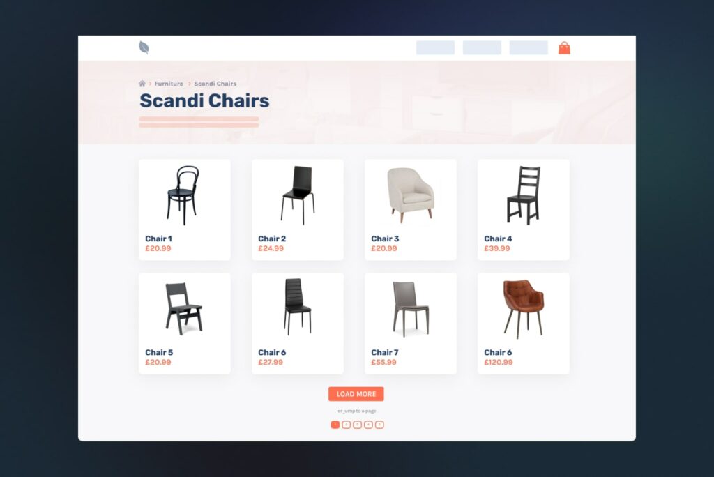
Pagination is a crucial element of any eCommerce category page, as it allows customers to navigate through a large number of products with ease. Without it, customers might have to endlessly scroll through products, leading to a frustrating and confusing experience. However, it’s important to use pagination correctly.
One useful tip is to limit the number of products displayed per page to a reasonable amount, such as 12 or 24, to avoid overwhelming the customer. Additionally, clearly labeling the page numbers and providing navigation to move between pages, such as “Previous” and “Next” buttons, helps customers easily locate and navigate through the products they’re interested in.
Ultimately, proper use of pagination can enhance the user experience and increase the likelihood of a sale.
#12 Ensure high page loading speed
Customers now expect online stores to provide them with a vast range of options and quick results. Slow loading speeds can cause frustration, resulting in lost sales. Prioritizing site speed is essential to ensure a better user experience, improved SEO, and higher conversion rates. Research shows that 45.4% of customers are likely to leave your store with empty hands if it loads longer than expected. That’s not a joke. So always keep an eye on your site’s loading speed and optimize it.
#13 Enhance mobile shopping experience
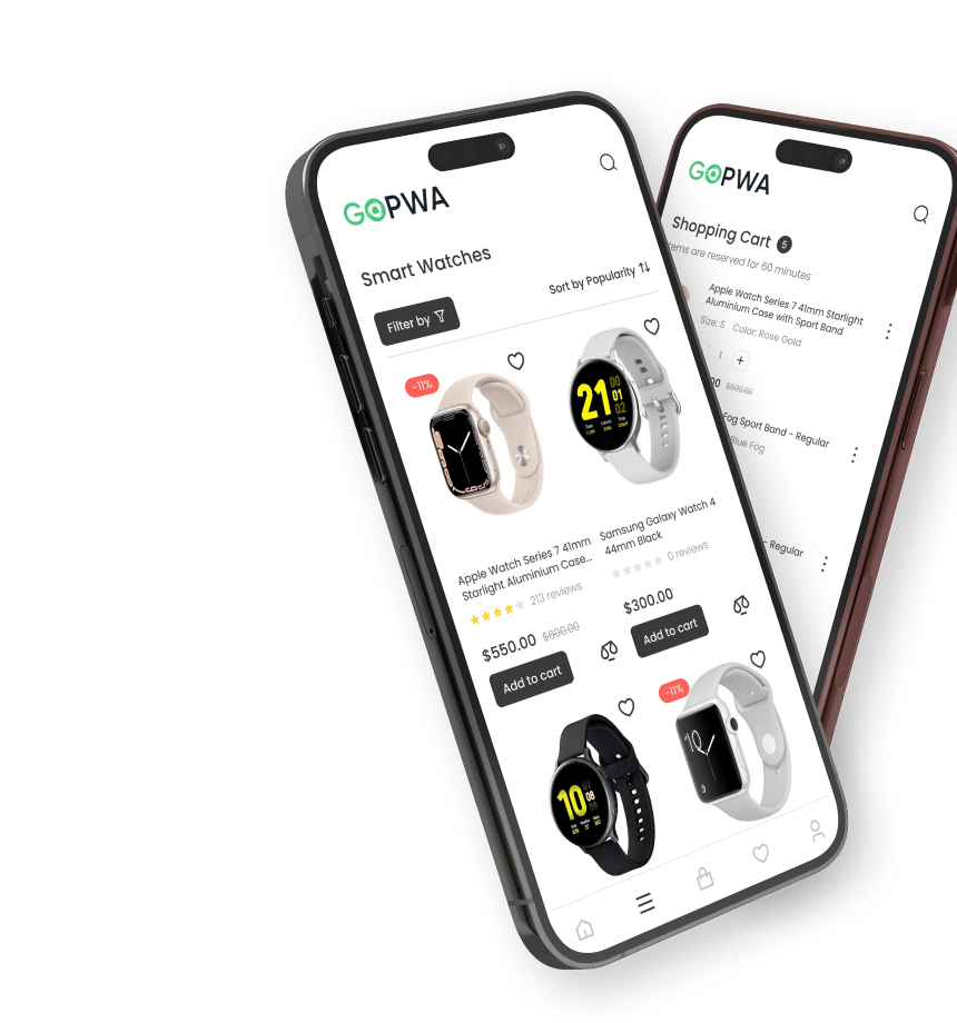
With mobile devices being the go-to option for shoppers, it is crucial to optimize category pages for mobile devices. The main goal of category pages is to help customers find what they need easily, and this is especially important for mobile users. Usability and transparency should be top-of-mind in your mobile eCommerce category page design. Failing to do so may result in cart abandonment.
Here are some pro tips:
- Provide shoppers with the option to toggle between grid and list views
- Allow them to select the number of products displayed per page
- Use collapsible toggles to manage product filters
- Ensure category layouts are responsive on different mobile screen sizes
- Use pagination instead of infinite scrolling to avoid overwhelming users.
#14 Optimize for SEO
eCommerce category pages can be an excellent source of ranking and shopping traffic. With the right keywords, you can optimize your category pages to drive more prospects to your site and increase sales. Here are some SEO practices that you should implement for your category pages:
- Use relevant keywords
Incorporate your primary keywords in the category title, product headlines, URL, image titles and alt descriptions, category, and product meta descriptions, and product descriptions.
- Set the canonical tag
Setting the canonical tag on your HTTPS URLs helps search engines identify the correct URL to index, preventing confusion and duplicate content issues.
SEO Ready to dominate the search rankings? Let’s make it happen together. Grow organic traffic to boost performance, increase conversions, and sell more. No Black Hat SEO.
- Implement structured data markup
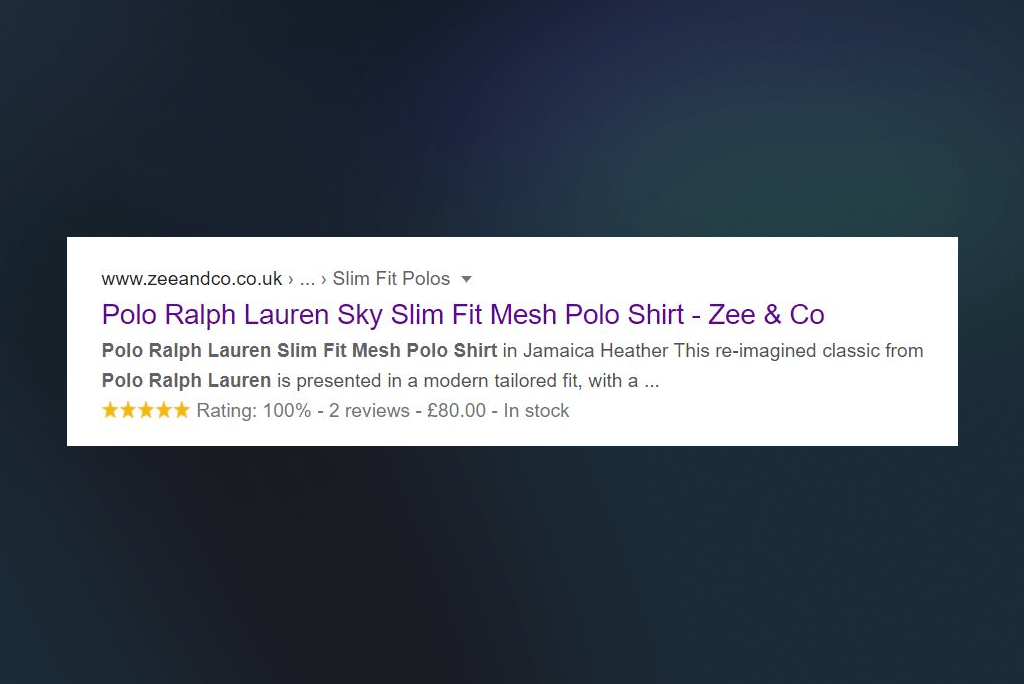
Implementing schema markup for your product pages can significantly boost your click-through rate, impressions, and average ranking positions. Use the Google Structured Data Markup Helper to markup your category and product pages and add extra details to the search results (e.g., prices, availability, star rating).
- Build quality links
Create quality links to your store and list it on well-known business directories to increase your visibility and drive more traffic to your category pages. Publish helpful content and distribute it on social media, consider using affiliates to promote your products, and encourage shoppers to share your category pages with their friends on social media. Implementing these practices can help your category pages rank higher, drive more traffic, and increase sales.
The bottom line
Following the eCommerce category page best practices we gathered is essential for any online store looking to improve its sales and customer experience. By optimizing category pages for search engines, implementing pagination and mobile-friendly designs, and providing relevant and helpful category descriptions, you can increase traffic and conversions on your website.
Don’t forget to monitor your metrics regularly and make adjustments accordingly. By consistently applying these best practices, you can create an enjoyable shopping experience for your visitors and set your eCommerce store up for success.


