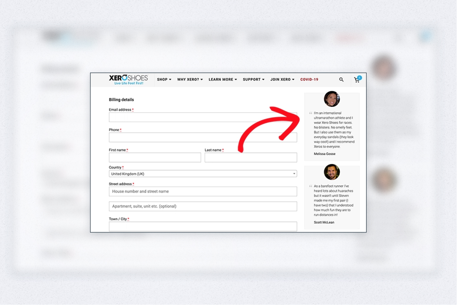
One of the greatest challenges for any online store is converting browsers into paying buyers. And the checkout experience is a key deciding factor that can make it happen. When a shopper has added the desired products to the shopping cart, that’s not the end. An overly complicated, misleading, slow, or long-winded checkout can make a visitor abandon their cart and possibly never come back again.
In this article, we’ll cover 13 proven checkout page design best practices for optimizing your checkout to:
- boost conversions
- reduce cart abandonment
- and generate more revenue.
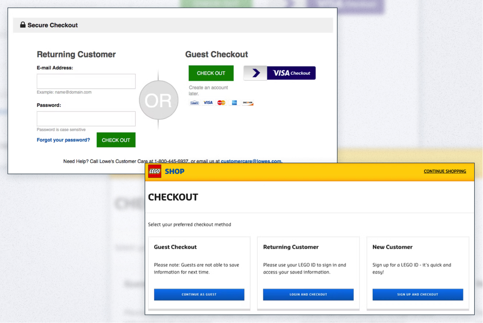
#1 Allow guest checkout
Typically, customers would create an account before entering their billing information. But in the digital age, when people create multiple accounts here and there, they often get annoyed when they need to sign in, let alone remember all those passwords. In fact, 24% of customers would abandon the cart if the store requires them to create an account. If you notice that potential customers don’t complete their checkout process when they realize they have to sign in, consider enabling guest checkout.
See how you can benefit from this:
- Faster checkout. The level of ease, lower commitment, and no need to provide more personal information than they want to, will be appreciated by a large segment of shoppers (especially on mobile devices).
- Higher conversion rates because of the faster checkout process.
- More trust. First-time visitors may not trust your business enough to become registered users. The smoother the ecommerce checkout flow will be, the more likely they will be to create an account for further purchases.
- More impulse purchases. By offering up-selling and cross-selling options at the checkout (we’ll talk about that a bit later), you get a chance to increase sales and generate more revenue. And with faster and simpler guest checkout, those chances increase.
It’s important to note that offering a checkout without registration isn’t a smart move for each online store out there. If a customer returns to your store later for another purchase, they’ll need to enter their shipping and billing information again. Having an account implies they can skip this step.
Here are some issues you can run into by enabling guest checkout:
- Customers won’t be able to reorder products easily
- It’ll be difficult for you to track orders
- You won’t be able to link a customer’s order history to loyalty or other programs where accounts are required
- Customer service will find it difficult or time-consuming to assist shoppers with their issues
When deciding whether guest checkout is the right fit for your web shop, remember that this type of checkout is most beneficial to stores that are least likely to receive frequent orders from the same shoppers.
#2 Offer a single-page checkout
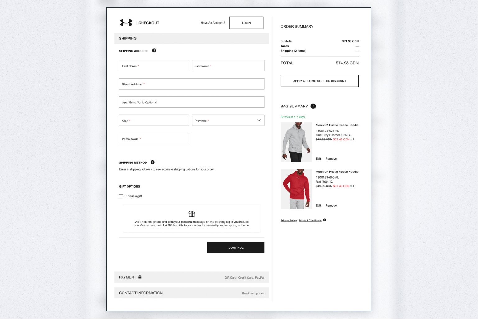
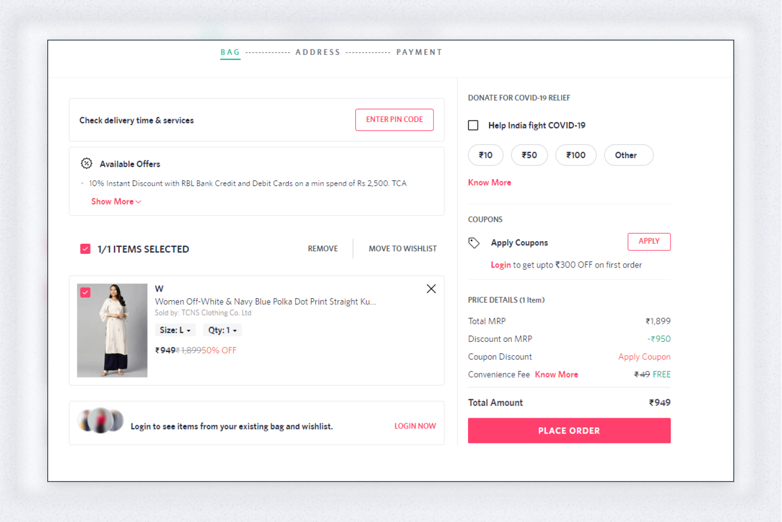
A too long and complicated checkout process is one of the top reasons to abandon their cart for 17% of online shoppers. Consider reducing the checkout process to one page. With a single-page checkout, all the steps are packed within one page with minimum navigation. This allows customers to fill out all the details in one go, which makes it simple from a shopper’s perspective.
Adding all the checkout steps on a single page may make it lengthy. In this case, you can add a progress indicator. It will help customers identify the stage of the checkout process they are at. A typical checkout flow can have the following steps:
- Entering billing information
- Choosing a payment method
- Reviewing order details
- Completing the purchase
A progress indicator lets customers see how close they are to purchasing their chosen item, which will definitely improve their shopping experience.
#3 Enable smart form filling
Form filling is an important part of the checkout process, so you want to make it as easy and user-friendly as possible. Intelligent form filling includes using autofill options like Google Autofill or shipping address lookup and verification tools. For the billing address, offer a checkbox or a radio button to let shoppers select the same address they used for shipping. In this way, you make form filling quick, simple, and error-free.
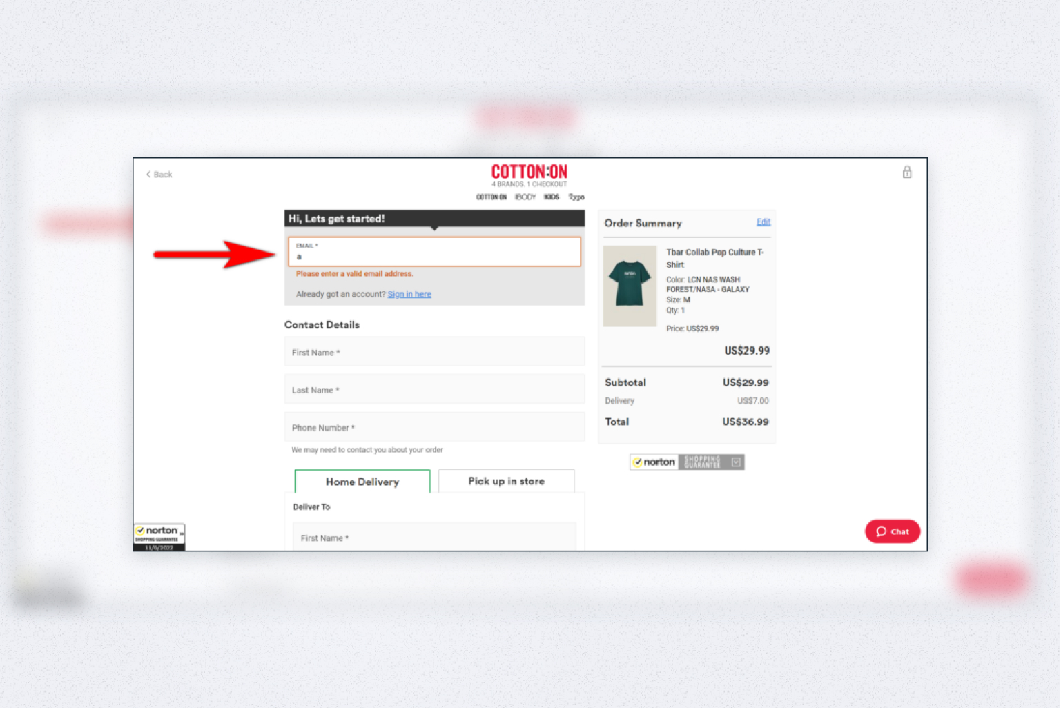
To get more accurate details and reduce errors on the spot, add data validation and input error notifications. It will enable a smooth data entry process for your customers, and the confidence in the reliability of information for you.
Also, don’t forget to notify shoppers about missing fields. Ensure you sound helpful rather than robotic and dry. It would be friendlier and more caring to display a message like “Oops! You forgot to enter your city” instead of “City is required”.
#4 Provide several payment options and currencies
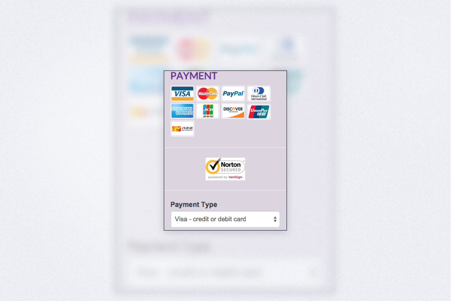
Merchants that don’t offer unique payment options fail to provide convenience and thus are at risk of losing customers. Offer a variety of methods to choose from and prioritize the most popular and used first, especially those that support global transactions. You can offer currency conversion options. However, letting them pay in the desired currency would be far better since currency conversions add extra costs.
If you sell globally, you’ll deal with taxes. Tax requirements vary depending on the country. To make the checkout smooth and frictionless, ensure international taxes are calculated dynamically based on the customer’s location. Enabling a multilingual checkout might become another decisive factor for global shoppers to purchase from you. Talk to customers in their local language.
The above-mentioned practices will ensure a seamless localized payment experience for customers, which can lead to winning their loyalty and, ultimately, more sales.
#5 Ensure security
eCommerce is one of the top industries most vulnerable to cyberattacks. And that’s obvious since eComm sites use customers’ sensitive data. For 92% of consumers, security is critical when shopping online. So you want to ensure shoppers feel safe about transactions they make through your online store. Otherwise, they’re likely to abandon their carts.
Make sure you use secure payment methods and prominently display trust seals. That will breathe confidence in store visitors and make them complete the purchase. Here are some regulations you should comply with:
- SSL (Secure Sockets Layer) certificate to provide a secure connection and protect credit card details
- PCI DSS (Payment Card Industry Data Security Standard) for secure transactions
- CCPA (California Consumer Privacy Act) and GDPR (General Data Privacy Regulation) for storing sensitive customer information
- MFA (Multi-factor Authentication) for extra security over the login
#6 Allow saving the checkout progress and contents
Sometimes the shopping journey may be interrupted for some reason. Let customers easily resume their progress and complete the purchase without starting everything over. You can offer shoppers to save the contents of their cart or simply autosave their chosen items if they leave your store. This practice will increase the likelihood of customers purchasing from you.
#7 Avoid distractions
As mentioned before, the checkout should be clear and clean, and include no distractions. Ensure you remove any distractions to keep shoppers focused and on track and guide them through to the end of your conversion funnel. Consider removing the header and footer, unnecessary buttons, and menus, and make the checkout an isolated page. By minimizing distractions at the checkout, you can boost conversions and reduce cart abandonment.
#8 Maintain cost transparency
When shoppers add items to their cart, they expect to see only shipping costs added. And if they reveal there are other extra fees they weren’t aware of before the checkout, they are likely to flee without making a purchase. Provide as many details as possible including shipping fees, applicable taxes, a subtotal, and a final total up front. This will help prevent customers from abandoning their carts at the very last moment and establish trust.
#9 Offer up-sells & cross-sells
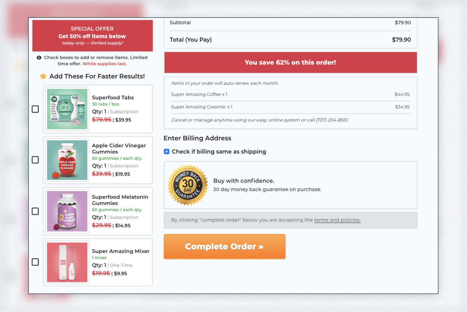
If you think selling ends at the checkout, you’re not completely right. Up-sells and cross-sells are effective ways to tempt visitors to buy more. But too many options can be overly distracting.
Remember that you shouldn’t go overboard with your up-sells. If a buyer picked a 10-dollar disposable razor, you can offer a non-disposable one at $30. But don’t pitch an expensive $200+ electric shaver since that’s a huge price difference.
When choosing what items to display as cross-selling options, opt for smaller ones so that shoppers can easily agree to grab them. For example, if you sell clothes you can offer belts, hair accessories, or jewelry and if you’re a grocery store owner, you can show chewing gum or snacks, if you run a show store, you can offer a care spray or a shoe sponge. Anything shoppers can grab on their way without thinking about it too much would work great.
#10 Add customer support options
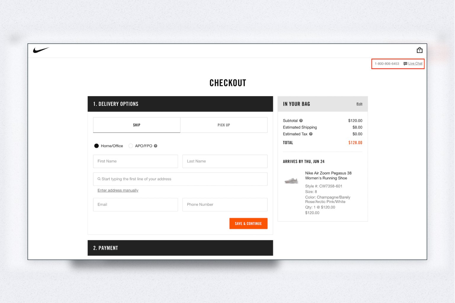
Ensure you provide easy access to customer support so that shoppers can find help if they need it. You can do it in multiple ways: enable a live chat, offer a support phone number, provide a knowledge base. This will help quickly solve the commonly experienced issues, keep buyers on track, and build trust. Another good idea would be to trigger a chatbot on the customer inactivity to assist them.
#11 Collect feedback
Collect feedback from shoppers who abandon their cart to understand why they leave and what you can do to improve. Follow-up emails, exit-intent popups, chatbots will work great for this purpose. Customer feedback will let you find out where to add user support, how to adjust form fields, or what design changes to make to optimize the checkout for higher conversions.
Development Get a robust PWA
Supercharge your eCommerce efforts with superb UX and ‘superfast’ speed. Build an eCommerce PWA from scratch or save time and money using GoPWA Storefront.
#12 Reference customer reviews
93% of people read online reviews before making a purchase. Let customers get a better idea of the chosen product by displaying what others think about it. By integrating customer reviews, you instill confidence in shoppers not only in the item they are going to purchase but also in the quality of service coming along with it.
#13 Optimize for mobile
According to the latest statistics, in the 2nd quarter of 2022 roughly 60% of web traffic worldwide was generated by mobile devices. At the same time, mobile conversion rates are twice as low as desktop. This suggests shoppers prefer browsing products on their mobile devices but tend to make purchases on desktops or laptops. So to truly succeed, you need to ensure a smooth checkout experience across all devices.
Here are some helpful tips for a great mobile checkout to drive conversions:
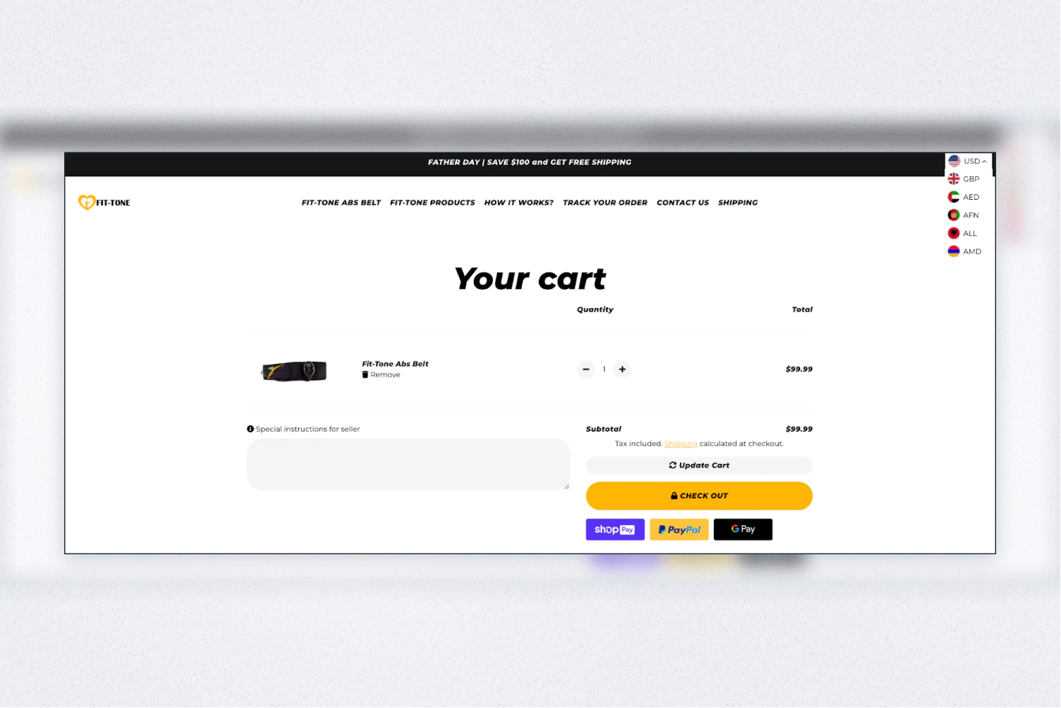
- Make the checkout button prominent. Use contrasting colors, enable a floating button, make sure the cart button is visible on top of the page all of the time, and place the checkout button above the fold.
- Keep it simple and clutter-free. Get rid of any unnecessary information since smartphone screens offer little space. You want to keep the shopper’s attention on key buttons — “Buy” and “Checkout”. Also, keep form fields to the minimum.
- Offer in-app payments. This will let customers pay with one simple click without leaving the store, which is especially significant for mobile shoppers.
Wrapping up
Your eCommerce checkout page is full of people who consider your store good enough to make a purchase. They’ve browsed your catalog, filled up their cart, and are ready to complete the purchase. The last thing you want them to do is leave your store without making a purchase because of a poor checkout experience. Leverage the 13 checkout optimization best practices we gathered to let more shoppers complete the transaction and become your regular customers.


