The eCommerce landscape is evolving to meet the growing expectations of online shoppers. Beyond mere convenience, buyers now desire a simulated in-store experience that engages their senses and provides a personalized touch. Brands are recognizing this need and are incorporating innovative technologies like artificial intelligence (AI) to deliver a more immersive and tailored shopping experience.
By leveraging these technologies, eCommerce companies can create an alternate reality for customers, enabling them to escape the uncertainties of the real world while making their purchases. This shift towards interactive and personalized experiences is crucial for driving customer engagement and fostering brand loyalty.
Let’s explore the top 11 eCommerce design trends for 2023 that highlight how brands are embracing these challenges and enhancing the online shopping experience.
#1 Micro animations
Just as you would entertain visitors in your brick-and-mortar store, it is equally important to engage and captivate your website visitors to prevent them from leaving and taking their business elsewhere. Enter micro animations, a valuable tool in achieving this goal.
Micro animations, such as animated CTA buttons or interactive icons, are designed to catch the visitor’s eye and provide an engaging experience. Imagine a button that comes to life with a playful animation when clicked or an email icon transforming into a flying paper plane upon sending a message. These small, subtle animations have a significant impact on user engagement and retention.
#2 Animated product reveals
To create a truly memorable and entertaining experience, brands are embracing animated interactions. 3D animations, hover effects, and scroll animations are now the trend, offering a playful and innovative approach to inform customers about their journey through the brand’s platform. These animations captivate users’ attention and highlight key product details and features. For example, scroll functions are being modified to unveil brand stories and showcase product features, while 3D animations bring rich content to eCommerce designs, enabling customers to visualize products in real time.
Web Design Create a visually captivating and highly functional online store that drives conversions and sets you apart from the competition.
#3 Centered navigation menu
Departing from traditional left or top-aligned menus, the centered navigation menu brings a fresh and modern approach to streamline the user interface.
The centered navigation menu is characterized by its placement at the center of the web page, typically at the top or just below the hero section. This design choice immediately captures users’ attention, creating a focal point that draws them into the website. By eliminating the need for horizontal scrolling or eye movements to navigate, this style of menu promotes a seamless and intuitive browsing experience.
One of the key benefits of a centered navigation menu is its ability to adapt to different screen sizes and devices. With the rise of mobile shopping, responsive design has become crucial. The centered menu naturally scales and adjusts to fit various screen widths, ensuring consistency and ease of use across desktop, tablet, and mobile platforms.
Beyond its aesthetics, the centered navigation menu also allows for a cleaner and more minimalist design. By reducing clutter and placing navigation options in a centralized location, brands can create a visually appealing interface that focuses on the essential elements. This minimalism enhances user focus, making it easier for customers to find what they’re looking for and navigate through the website effortlessly.
#4 Multidirectional layouts
In 2023, the multidirectional layout is set to revolutionize eCommerce user interfaces, offering businesses a dynamic and user-friendly way to showcase their products. This innovative layout enables customers to interact with the website in a more intuitive manner, breaking free from the traditional up-and-down scrolling limitations.
With the multidirectional layout, users can now explore products by scrolling not only vertically but also horizontally and diagonally. This freedom of movement empowers customers to compare products side-by-side, making well-informed purchase decisions. The result is a more engaging and interactive shopping experience that captivates users and keeps them immersed in the website.
Beyond its practical benefits, the multidirectional layout brings a heightened level of aesthetic pleasure to the design. The intuitive connection between user actions and website responses creates a visually pleasing and seamless browsing journey. This trend aligns perfectly with the principles of mobile-first design and interactive shopping experiences, catering to the evolving needs of modern consumers.
#5 Vaporwave aesthetics
Step into a futuristic, cyberpunk-inspired world with the rising trend of vaporwave aesthetics in eCommerce design. This unique style draws inspiration from the past while embracing a dystopian visual language, creating an intriguing and captivating experience for users.
Characterized by vibrant colors, high-tech elements, and glitchy details, vaporwave aesthetics take cues from the 1980s and 1990s, incorporating psychedelic fonts, neon pastel color schemes, and gradient color blending. This fusion of retro and futuristic elements creates a distinct visual identity that has quickly become a part of contemporary web culture.
In the realm of eCommerce, vaporwave aesthetics serve to create a sense of anticipation and allure, enticing customers to explore products and websites further. The unconventional and avant-garde design elements evoke curiosity and engage users on an emotional level. This aesthetic is particularly effective when a store aims to infuse their products and brand with an antique or nostalgic feel.
If the full vaporwave aesthetic feels too daring for your brand, there’s room for customization. Select specific components that align with your brand identity and adapt them to fit your eCommerce business. By incorporating subtle touches of vaporwave elements, you can add a unique flair and create a visually striking experience while maintaining brand coherence.
#6 Dark mode
Dark mode has emerged as one of the most contemporary trends in eCommerce web design, transforming online stores into visually striking and eye-friendly websites.
This design choice is particularly effective on OLED screens, which do not require a backlight like LED screens. With the prevalence of OLED displays in recent smartphones, incorporating dark mode becomes an ideal strategy to target smartphone users.
Why is this trend important? By 2023, retail mobile commerce sales are expected to account for 43.4% of all eCommerce sales. Implementing dark mode can help your website shine brightly in the competitive landscape, leaving your rivals in the dark.
Here are three ways dark mode can elevate your online store:
- Creative edge
Dark mode gives your store a creative edge, setting it apart from the competition. The visually distinctive aesthetic creates a memorable impression and stands out in users’ minds.
- Enhanced visual hierarchy
By leveraging dark mode, you can make important elements and content stand out more prominently. The contrasting colors against the dark background create a clear and visually appealing visual hierarchy, guiding users’ attention to key information.
- Battery savings
Dark mode benefits customers using OLED screens by reducing power consumption and extending battery life. This feature is especially valuable for mobile users who rely on their devices throughout the day.
Even industry giants like Google and Spotify have embraced the dark side. The popularity and adoption of dark mode further validate its status as a prominent trend for 2023 and beyond.
#7 Unusual page transitions
Animated transitions, also known as page transitions, are clever design elements that enhance user experience by creating engaging and visually appealing transitions between pages. These transitions animate elements as the page loads, emphasizing the change and providing an interactive layer that captivates users.
By incorporating animated transitions, you can add a layer of interactivity that elevates the overall browsing experience, making it more enjoyable and memorable for users. While it is an optional addition, it serves as a fantastic way to enhance user engagement and navigation on your website.
When implemented effectively, animated transitions can breathe life into your website and make it more dynamic. They create a seamless flow between pages, grabbing users’ attention and encouraging them to explore further. This interactivity contributes to a longer time spent on your website, as users appreciate the visually pleasing and engaging transitions.
For example, Zero, a branding studio in NYC, uses image effect transitions with creative page transitions and a side navigation menu. This will be noticed by online customers, who will appreciate them. More time is spent on your website as a result.
#8 Progressive filter functions
Filtering is a crucial aspect of eCommerce web design, enabling customers to find products quickly and effortlessly. However, relying on a simple drop-down menu for filtering may not leave a lasting impression. To truly captivate users and keep them engaged, it’s essential to go the extra mile in designing your filter function.
A well-crafted and engaging filter function can make all the difference in retaining customer interest and driving sales. By hooking visitors immediately, you can encourage them to explore your website for longer, increasing the likelihood of conversions.
Here are three exciting ways to create a fun and interactive filter function:
- Personalized, click-activated journey
Build a filter experience that takes customers on a personalized journey. Incorporate clickable elements that dynamically update the displayed products based on their selections. This interactive approach adds an element of surprise and customization, keeping users engaged and eager to discover more.
- Sliders for specific metrics
Replace traditional drop-down menus with intuitive sliders for searching specific metrics such as price, weight, or color. Sliders offer a more interactive and visually engaging way for users to refine their search criteria, making the filtering process more enjoyable and efficient.
- Build-Your-Own product experience
For businesses that offer personalized products, enable users to build their ideal product step by step. Allow them to select and customize various options along the way, such as color, size, materials, and features. This interactive and immersive filtering experience empowers customers to create a product that perfectly aligns with their preferences, fostering a deeper connection and driving purchase intent.
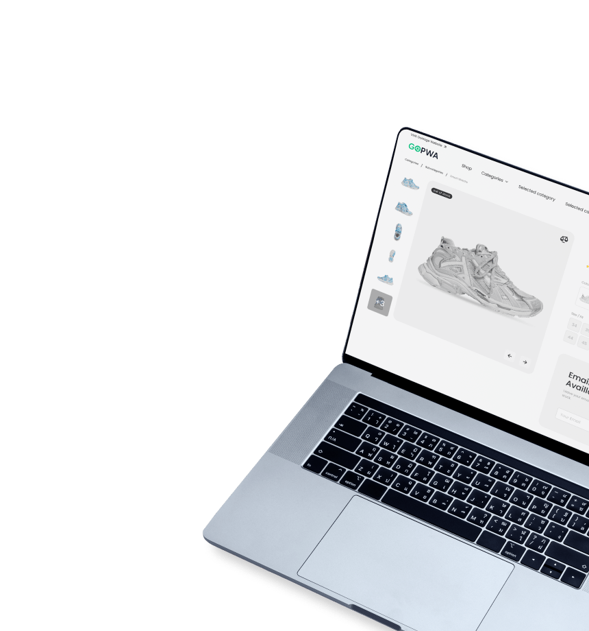
Development Get a robust PWA
Supercharge your eCommerce efforts with superb UX and ‘superfast’ speed. Build an eCommerce PWA from scratch or save time and money using GoPWA Storefront.
#9 Chunky fonts with saturated colors
In today’s digital landscape, it’s crucial to infuse your brand’s online presence with personality. Chunky, heavy-weight fonts paired with saturated colors can instantly brighten up your users’ day and leave a lasting impression. This is especially true for Gen Z, who find hope and optimism in vibrant hues. As the world often feels bleak, brands are stepping up to offer a ray of light and positivity to individuals.
Opting for thick, sans-serif fonts or smooth, rounded typography not only grabs users’ attention but also creates a warm and welcoming vibe throughout your design. Like a fluffy and huggable teddy bear, chunky fonts make your brand look approachable and friendly. The result? An aesthetic that elicits positive feelings toward your brand in the minds of your customers.
Color choices play a significant role in enhancing chunky fonts. Color psychology suggests that different colors can influence a person’s subconscious and affect their mood. Colors also reflect current fashion, design, and societal trends. By combining cheery colors like yellow, orange, or pink with chunky typography, you can elevate your brand’s visual identity and create a lasting impression on your customers.
#10 AI-powered chatbots
In 2023, AI technology has reached new heights, enabling brands to leverage advanced chatbots that play a pivotal role in completing the buyer’s journey. While chatbots are not a new concept, their advanced capabilities have made them one of the most impressive trends in eCommerce web design.
Unlike basic chatbots, advanced chatbots utilize sophisticated AI algorithms to provide rapid and tailored responses, enhancing the customer experience. These chatbots can assist with transactions, guide users through the sales process, and offer personalized recommendations.
While basic chatbots can be developed at a relatively low cost, advanced chatbots require a much higher investment. Considering this aspect, advanced chatbots are best suited for medium or large businesses, or small businesses willing to heavily invest in AI technology.
Here are the top three benefits of incorporating advanced chatbots:
- Improved customer experience
Advanced chatbots deliver instant and personalized responses, ensuring a seamless customer experience. They can address queries, provide product recommendations, and assist with purchases, creating a sense of efficiency and customer satisfaction.
- Increased staff efficiency
By automating repetitive tasks and handling customer inquiries, advanced chatbots free up staff members to focus on more complex or strategic tasks. This allows businesses to optimize their resources and improve overall productivity.
- Enhanced sales opportunities
Advanced chatbots have the potential to boost sales by facilitating orders directly through the chatbot interface. Customers can make purchases, track their orders, and receive personalized offers, providing a convenient and frictionless buying experience.
With their ability to deliver exceptional customer service, improve staff productivity, and drive sales, advanced chatbots have become a valuable asset in eCommerce. By integrating these intelligent conversational agents into your web design, you can elevate the buyer’s journey and stay ahead in a competitive market.
#11 Curved frames
The use of curved lines in architecture has long been known to create a smooth and seamless transition between spaces, enhancing the cozy and homey feel of interiors. Similarly, when applied to eCommerce platforms, geometric shapes with curved lines evoke a sense of warmth and calmness, enhancing the overall user experience.
This design trend has gained popularity among eCommerce brands, particularly those in the cosmetics and clothing industries that lean towards a cleaner, modern, and minimalistic aesthetic. You may have noticed how platforms like YouTube utilize rounded corners in their thumbnail frames, allowing for effortless visual scanning.
In the digital realm, audiences seek smooth, pleasant, and reliable experiences. Brands are taking this concept to heart by embracing flowing curves and eliminating harsh edges in their design frameworks. By incorporating curved lines, brands can showcase a unique, authentic, and softer side of their personality. This subtle technique conveys a humanistic touch, resonating with audiences on a deeper level.
When implemented in asymmetrical designs, curved lines add a touch of uniqueness, further highlighting a brand’s individuality. This approach allows brands to showcase their personality and stand out from the competition, creating a memorable and engaging experience for users.
Which eCommerce design trend is the right choice for you?
In 2023, audiences are seeking a break from reality and craving positivity and light in their digital lives. With the advancement of accessible technologies, brands are leveraging these opportunities to deliver captivating experiences.
This year’s ecommerce design trends reflect the audience’s desire to immerse themselves in an idealized version of reality while shopping online. They seek the convenience and personalization of a shopping assistant available at any hour, all from the comfort of their homes. As a result, businesses are stepping up their game.
By embracing the yearning for escapism, ecommerce brands are delivering personalized and engaging experiences that transport customers to a world of their own. This trend taps into the human desire for connection, entertainment, and convenience, allowing brands to forge deep and lasting relationships with their customers.
Consider the needs and preferences of your target audience, align them with your brand identity, and evaluate the goals you aim to achieve. Whether it’s embracing dark mode for a sleek and modern look, incorporating animated transitions for an engaging user experience, or implementing advanced chatbots to enhance customer interactions, each trend offers unique benefits.
Ultimately, the right choice depends on your specific business objectives and the experience you want to deliver to your customers. Stay informed, experiment, and adapt to the ever-changing landscape of eCommerce design to ensure your brand remains relevant, captivating, and successful in the years to come.
