According to Think With Google, detailed product information with enough visuals is a decisive factor when choosing a brand to buy from. That means your product page design can make or break an online sale. Well-designed, accurate, and visually appealing product pages help convert browsers into buyers by letting customers make informed purchases.
In our article, we’ll cover the top 14 best practices that will enable you to create or improve your online store’s product pages so that you can:
- skyrocket traffic
- boost conversions
- generate more sales
- grow your revenue
Let’s jump in.
Well, a shopper lands on your online store, starts wandering about various pages, and finally chooses a product to learn more about it. That’s the moment of truth since you’ll either have a sale or a lost customer. What will happen greatly depends on the quality of your product page design.
You should make sure the page is neither too stuffed with unnecessary information nor too simple. Remember that visitors can’t touch, feel, or try your products before making a purchase. So the role of your product page’s design and content is to help a shopper get to know your product well and to convince them to complete their order.
To help you begin, here’s the list of the top 14 tips for designing an inviting and conversion-boosting eCommerce product page.
#1 Prepare nice images and videos
Wondering why we started with images? That’s simple. People’s brains are literally hardwired to process images easier and faster than text. Did you know that 70% of all human’s sensory receptors are in the eye? Well, this information is enough to understand that great product images and videos are a must for an effective product page.
By rapidly scrolling down your product page, store visitors will need something to anchor their attention. Visual elements can help keep people longer on the site and build their trust. Never compromise on image quality. Invest enough time, budget, and effort in preparing nice and compelling images and videos to show the product in all its glory.
Here are some tips for great product images:
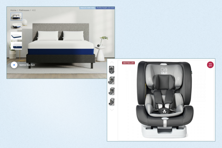
- Use high-resolution, zoomable images that communicate the details, features, and benefits of your product to store visitors. A poorly lit, pixelated image won’t excite your customers and will likely turn them away.
- Use more than 1 photo. Create an image gallery showing your product from all angles to help visitors visualize the product better, get a clear idea of what it looks like in real life, and have more confidence to buy.
- Optimize your product images to the smallest size. No matter how great your product image is if it takes an eternity to load. Keep in mind that not always shoppers have access to high-speed internet. If they can’t load your product image, they will be likely to leave without making a purchase.
- Ensure your product has a pure white or light background with soft or no shadows. By the way, if you sell your products on Amazon, you’ll be able to use those images since they meet Amazon’s requirements. So, two birds with one stone.
- Consider adding a 360-degree image or a video to engage customers even more.
- Don’t use images containing additional objects and providing no context. This might confuse customers, distract them, and create an impression that extra objects on the photo are part of the product.
- Add product images that change when a shopper changes one of the product attributes (color, size, etc.). Some people may find it difficult to visualize their chosen size or color. So use variant images and make sure they are zoomable as well.
#2 Write compelling product descriptions
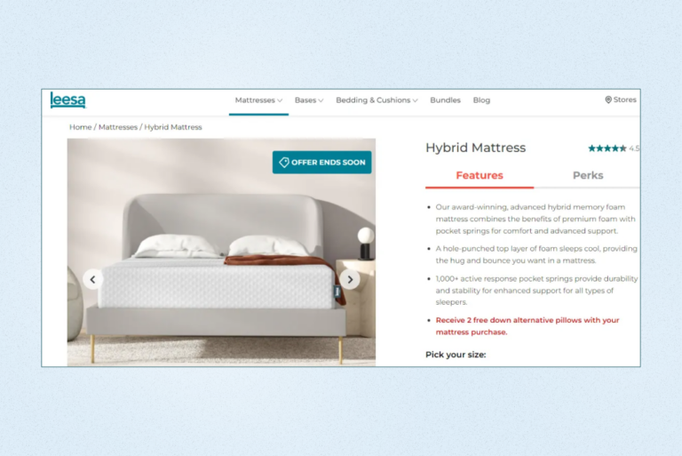
Product descriptions take the second place in the list of eCommerce product page elements influencing customers’ purchase decisions. They should clearly communicate the benefits of the product and help the page rank well in search results to bring in more customers to your online store.
The greatest challenge in writing product descriptions lies in optimizing them for a specific product page keyword and making them speak to your branding. A converting product description should be unique, appealing, and informative. Here are the questions a product description should answer the following questions:
- Who can use your product and what for?
- How does it work?
- What makes it special?
- Why buy this product?
Also, take a look at some tips for creating compelling product copy making your customers feel understood and related:
- Write with your audience in mind
- Focus on benefits rather than simply enumerating features
- Speak the regular shoppers’ language
- Use short, to-the-point sentences
- Rely on verbs rather than adjectives since the latter are less convincing
- Make it easy to scan — use bullet points
- Use large, easy-to-read fonts
Leverage the tips we offered to create new or update your existing product descriptions.
#3 Offer an intuitive layout
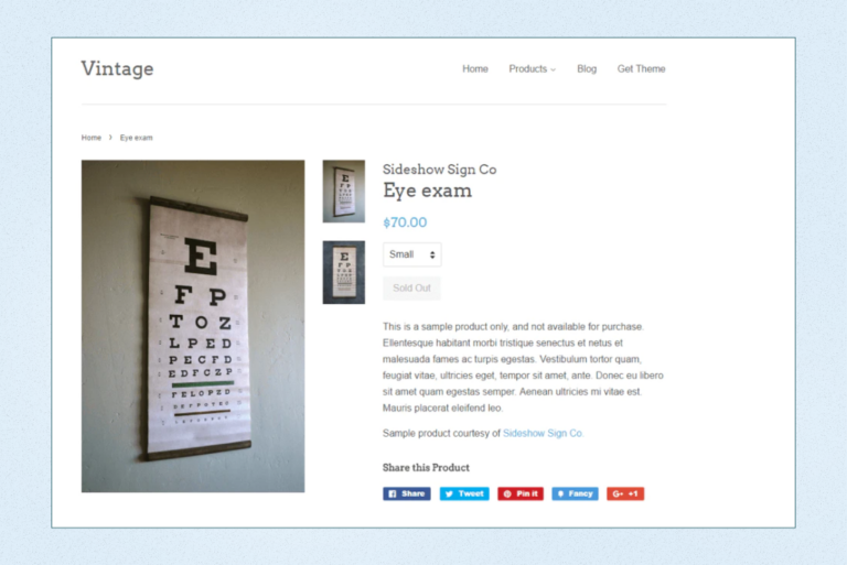
While a product description is expected to be unique and outstanding, an eCommerce product page layout should be simple and intuitive. It shouldn’t confuse visitors by making them seek for the buttons and sections they are used to. Simply put, they expect to find the product image on the left and the copy on the right, along with customization options and the prominent “Add to cart” button.
Another helpful tip we offer following is to develop layout templates so that adding new product pages to your online store will be as simple as copy-pasting sentences. Still, your product pages shouldn’t be identical — you can create slightly different templates for various product categories. A ubiquitous product page layout will help visitors intuitively find the information they are looking for, thus leading to higher customer satisfaction and increased conversions.
#4 Make the stock meter prominent and updated
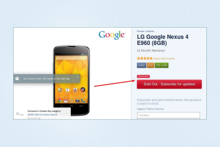
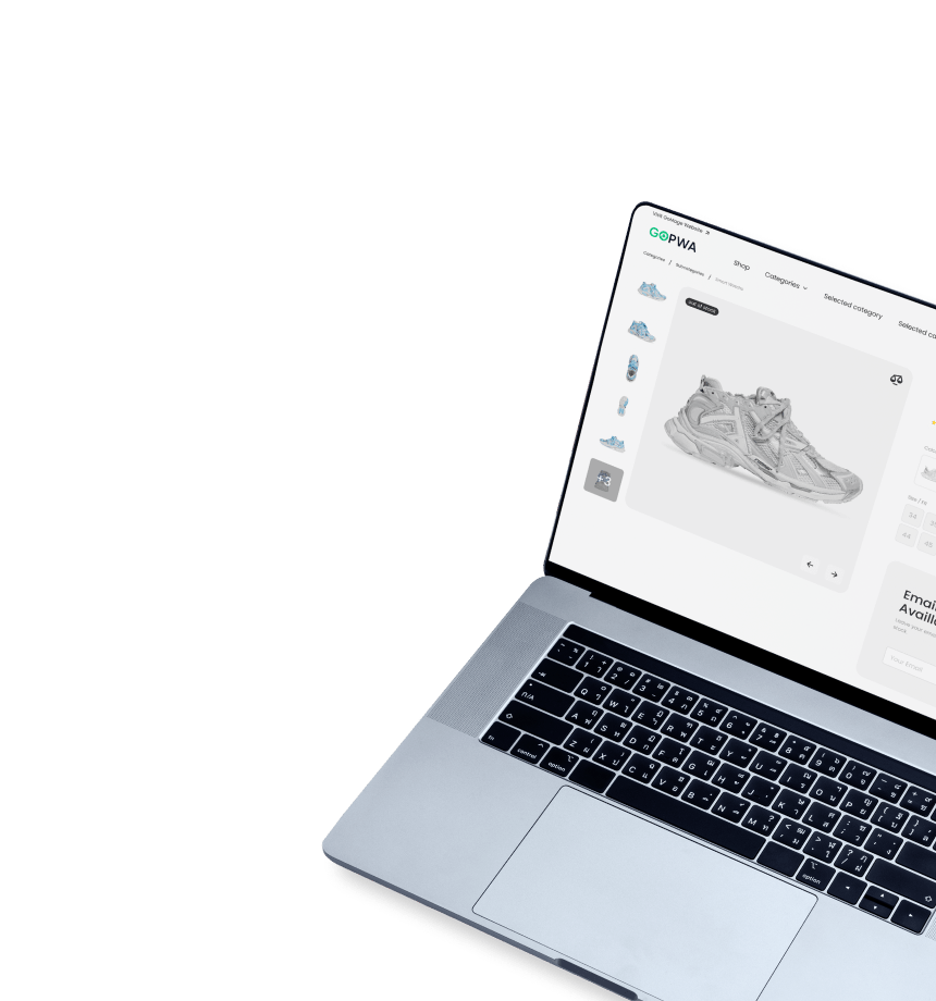
If you’re running low on the product, the worst thing you can do is to wait till checkout to inform the shopper about it. That’s a sure way to lose a customer — not only for this purchase but possibly forever. Ensure you keep a relevant and updated stock meter to show whether the product is available or not. It would also be perfect to add an option for users to get notified when the product is back in stock so they can order it.
To increase your store’s overall conversion rate, it is crucial to optimize each page of your eComm site.
Check out our article on eCommerce Homepage best practices to improve your online store’s user experience and increase conversions.
#5 Provide a user-friendly size selector
By offering a user-friendly size selection, you can achieve higher conversion rates. Size is one of the most common attributes to select before making a purchase. And that’s true for a wide range of product types — from hardware to beauty products to clothes.
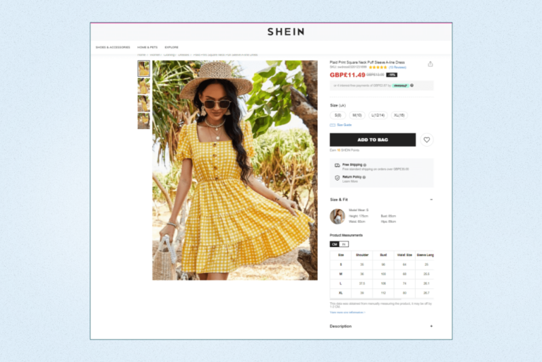
People across the globe have different ideas of sizes. Also, dimensions for S, M, L, etc. vary from manufacturer to manufacturer. Measurements are also different for various countries (e.g., Asian vs. US sizes). So it’s best to add a size chart to let people choose what fits them. Keep in mind that a drop-down size selector may be difficult to use on mobile devices. Consider offering a selector in a pop-up for customers’ convenience.
#6 Show prices in comparison
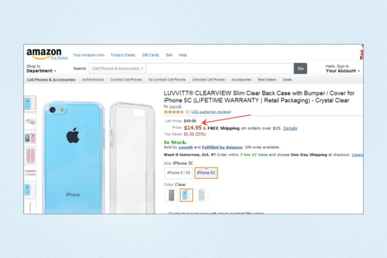
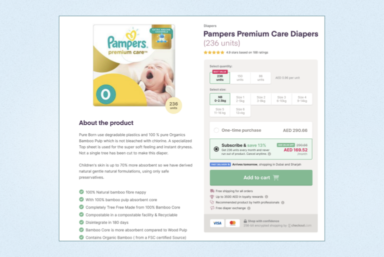
A product price is one of the key decisive factors when making a purchase decision. Don’t let your customers leave your site and check prices on other online stores. Clearly state pricing details close to your CTA. This information can trigger the buying decision. If you’re offering discounted prices, show this. Display both the actual price and the discounted one. You can also show how much customers can save by choosing to buy from you. Ensure you display both the percentage saving and the actual savings in a relevant currency since different people are enticed by different messages.
#7 Add a sense of urgency
Adding a sense of urgency is a common technique, especially in the eCommerce industry, since it helps to induce shoppers to complete their purchase right away. Behind the tactic stands the FOMO (Fear of Missing Out) effect.
Imagine you have been willing to get something for a long time but a hefty price tag prevented you from buying it. And suddenly you get an email from the store telling you can buy your desired product at a reduced price within 24 hours. Will you feel ecstatic? Yes. Will you make an order? Most likely. So will your customers.
Development Get a robust PWA
Supercharge your eCommerce efforts with superb UX and ‘superfast’ speed. Build an eCommerce PWA from scratch or save time and money using GoPWA Storefront.
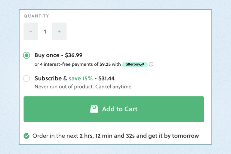
A sense of urgency helps encourage the buyer to complete a purchase right now. For this purpose, use a sales countdown timer. To amplify the FOMO effect, provide text indicating limited quantities, which adds a sense of scarcity. All this can help drive more sales.
#8 Place an eye-catching CTA
Call to action (CTA) is one of the crucial elements of product pages. You might think, “What can go wrong with a CTA on a product page?” However, there are some fundamentals to take into consideration while crafting an effective CTA on your product pages:
- Use clear words that tell directly what users need to do, how they need to act (e.g., “Buy now”, “Add to Cart”, “Quick Buy”, “Add to Wishlist”)
- Make sure the CTA button color abides by your page color scheme but stands out at the same time to win shoppers’ attention
- Check whether the CTA button text adheres to the local flavor (e.g., Amazon uses the “Add to Cart” version for the US audience and changes the text to “Add to Basket” for customers from the UK)
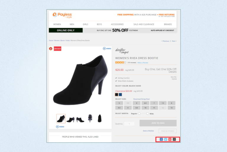
#9 Provide social sharing buttons
Most likely, your customers use at least one social media platform (Facebook, Pinterest, Twitter, etc.). They can share their purchases on these platforms if you offer social sharing buttons. In such a way, you’ll get a chance to promote your online store for free, especially for your most popular products. Such buttons make it more convenient for customers to share their shopping experience on your web shop by removing the need for copy-pasting and posting the content.
You can add nearly any social media network for sharing but that won’t be wise — some platforms just won’t be relevant. For instance, Pinterest is often used as a digital wishlist since it’s a highly visual network along with Facebook. Google Plus isn’t as popular as Twitter or Facebook and has far less users, so shared items won’t gain attention. LinkedIn isn’t a good option for sharing products since it doesn’t fit in with how most people use this network. To sum it up, limiting the choice to Pinterest, Twitter, and Facebook is likely to work best.
#10 Clearly state shipping and return policy
By not being clear and honest about shipping and return policy before customers reach the checkout page, you make them frustrated. They will be likely to abandon their cart right away and might even never come back. Provide as much information as possible to bolster shoppers’ confidence and answer all their potential questions. Besides, it’s very convenient to have shipping and return policies clarified right on the product page since customers won’t need to wander around your site to find the details.
Ensure the shipping policy includes the following information:
- Shipping costs and options (e.g., next-day delivery, 3-day shipping)
- Realistic delivery times
- Shipping restrictions (e.g., shipping to certain countries is unavailable)
- International shipping
- Return and exchange information
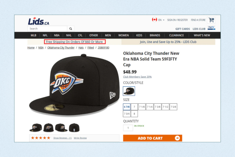
Also, if you offer free shipping for certain requirements, make sure you clearly state this near the main CTA.
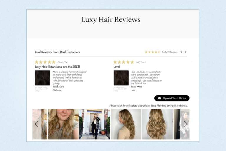
#11 Promote customer reviews
According to Dixa, 93% of shoppers rely on online reviews prior to making a purchase. That means you should include customer reviews on the product page to help buyers become more confident and close the sale without you putting much effort into it. By building trust with customers, you can enjoy increased conversions. Other benefits of promoting customer product reviews include:
- Providing better insights into the product. With the help of honest customer feedback, other buyers can understand what to expect from the product, its pros and cons, how it works, etc.
- Rectifying issues with the product. When the majority of customers point out the same problem with the product, it’s a sign that you should try to have the issue resolved.
- Gaining social proof. Customer reviews promote your brand and help you attract more traffic to your online store.
- Reducing returns. Customer feedback helps buyers know about the product’s advantages and downsides before purchasing it and minimizes unexpected impressions about it, thus reducing the possibility of returns.
#12 Offer product recommendations
When leveraged properly, product recommendations allow users to get a completely personalized experience. By presenting the right products at the right time, you can improve customer satisfaction as well as boost the AOV (Average Order Value). This will ultimately lead to higher conversion rates and more sales.
There are multiple ways to use customized product recommendations:
- Display your best-sellers
- Encourage people to be trendy by showcasing your current most popular products
- Show sales and discounts
- Display your highest-rated products
- Provide location-based recommendations
- Show browsing history-based recommendations
- Offer package deals (entire bundled sets of related items at a discounted price)
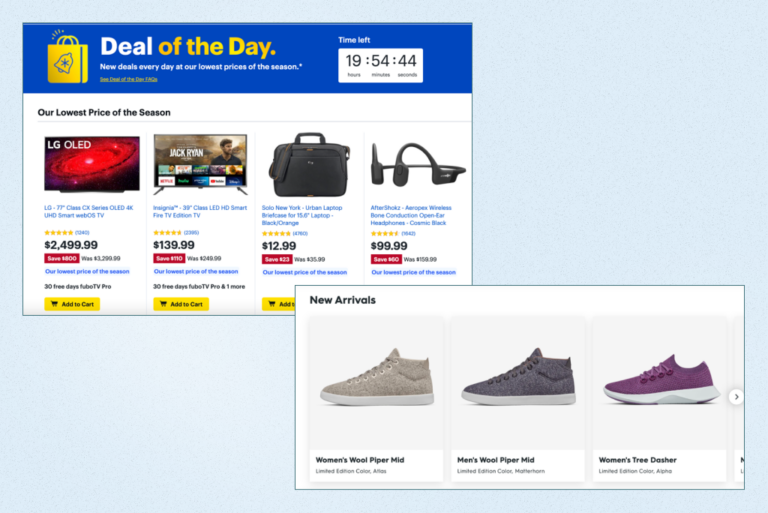
- Show new arrivals
- Promote daily offers
#13 Enable live chat
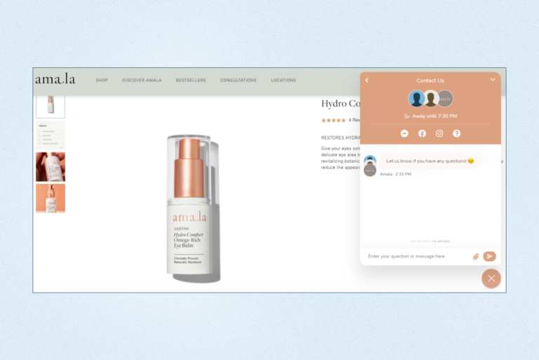
We believe you added the FAQ block to answer all customers’ potential questions. This undoubtedly makes your product page very user-friendly. But you can go the extra mile and enhance the customer experience by adding a live chat feature. This can positively impact conversions and help shoppers feel more secure about their purchases.
See what benefits you can reap by integrating a live chat on your online store:
- A live chat enables your store visitors to get quick help. Most people don’t want to wait for an email response or in a phone queue to ask for what interests them.
- Live chats save you time since a customer service representative can provide help to more than one person at a time, which makes their work more efficient.
- Live chats help prevent shoppers from hesitation. When a person has a question and can’t find the answer quickly, they’re likely to become less confident about making a purchase.
- A live chat provides insights into customer behavior. With a live chat, you can get quick feedback from customers right away without asking them to have a follow-up call or taking part in a survey via email. Plus, you get much easier access to analytics than you would have with email or phone support.
- Live chats humanize your store. A friendly live chat box offers immediate support from a real person, which feels closer to a traditional shopping experience.
#14 Ensure your page is designed mobile-first
You should have known about that already but there are two things worth remembering:
- mCommerce sales are projected to hit $728.28 billion and make up over 44% of retail eCommerce sales in the US by 2025.
- Google’s algorithms predominantly focus on the mobile version of the site when indexing and ranking.
These two things are enough to understand a smooth mobile experience is key to increasing conversions and driving more sales. And a higher quality of the customer experience can also amplify your eCommerce SEO efforts. With the mobile-first approach to design, more potential buyers can notice your store, visit it, and buy from you.
The Bottom Line
People love product pages that are designed for their convenience, speak directly to them, and make them feel confident and secure about their purchases. If you haven’t given much attention to your store’s product pages, it’s high time to leverage the eCommerce product page design tips we offered in the article to ensure your product pages are all set for getting your customers ready to check out and come back again soon.
