Establishing a strong online presence is crucial for businesses of all sizes. Whether you're an entrepreneur venturing into the world of online retail or an established brick-and-mortar store looking to expand your reach, a well-designed eCommerce website is the foundation of your success.
According to Top Design Firms, a significant 50% of consumers recognize the significance of website design in shaping a company’s brand.
In this article, you’ll learn how to design an eCommerce website that will convert visitors into buyers. Let’s start.
Tip #1. Keep your website design simple
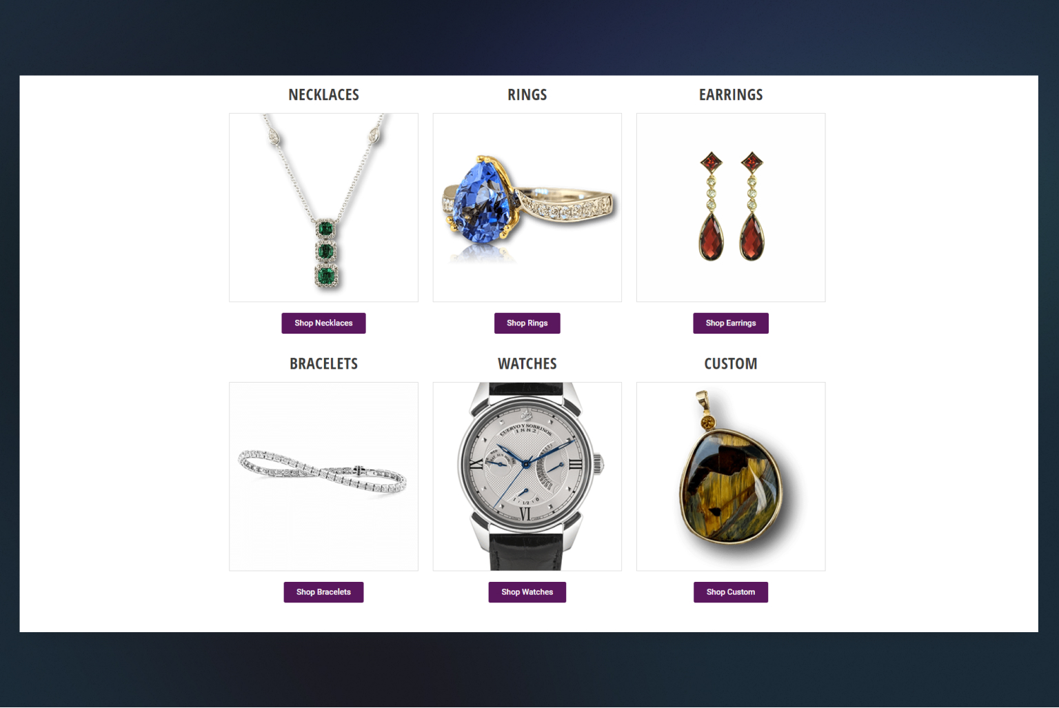
When it comes to designing an eCommerce website, simplicity can be a powerful ally. A clean and minimalist design not only enhances the visual appeal of your online store but also improves the overall user experience. Here’s why keeping the design simple should be your top priority:
- Clarity & focus
Simplifying your website design helps users quickly understand your brand, products, and navigation. By eliminating unnecessary clutter and distractions, you allow visitors to focus on the most important elements of your site, such as your products, special offers, and call-to-action buttons. Clear and concise messaging becomes more prominent, increasing the chances of conversions and sales.
- Easy navigation
A clutter-free design with intuitive navigation enhances user experience by making it effortless for visitors to explore your website. Incorporate a logical and streamlined menu structure, making it simple for users to find what they’re looking for. Well-organized categories and a search bar further aid in seamless navigation, ensuring visitors can easily discover and purchase products without feeling overwhelmed.
- Faster load times
A simple design typically involves fewer elements, reducing the overall file size and enabling faster load times. In today’s fast-paced digital world, users expect websites to load quickly. By optimizing your eCommerce site for speed, you minimize bounce rates and keep potential customers engaged, maximizing the chances of conversion.
- Mobile-friendly experience
With the rising dominance of mobile devices, it’s crucial to design your eCommerce website with mobile users in mind. A simple design translates well to mobile screens, ensuring that your site remains visually appealing and easy to navigate on smartphones and tablets. Responsive design techniques can be employed to adapt the layout seamlessly across various screen sizes, providing a consistent experience to all users.
- Brand perception
A simple and elegant design can create a positive brand perception among consumers. It conveys a sense of professionalism, sophistication, and trustworthiness. When customers associate your brand with a visually pleasing and user-friendly experience, it builds confidence and encourages repeat visits and word-of-mouth referrals.
Remember, simplicity doesn’t mean sacrificing creativity or unique branding elements. It’s about finding the perfect balance between an aesthetically pleasing design and functional user experience. By embracing simplicity in your eCommerce website design, you can create a visually appealing, user-friendly, and conversion-focused online store that resonates with your target audience.
Tip #2. Feature your most popular products prominently
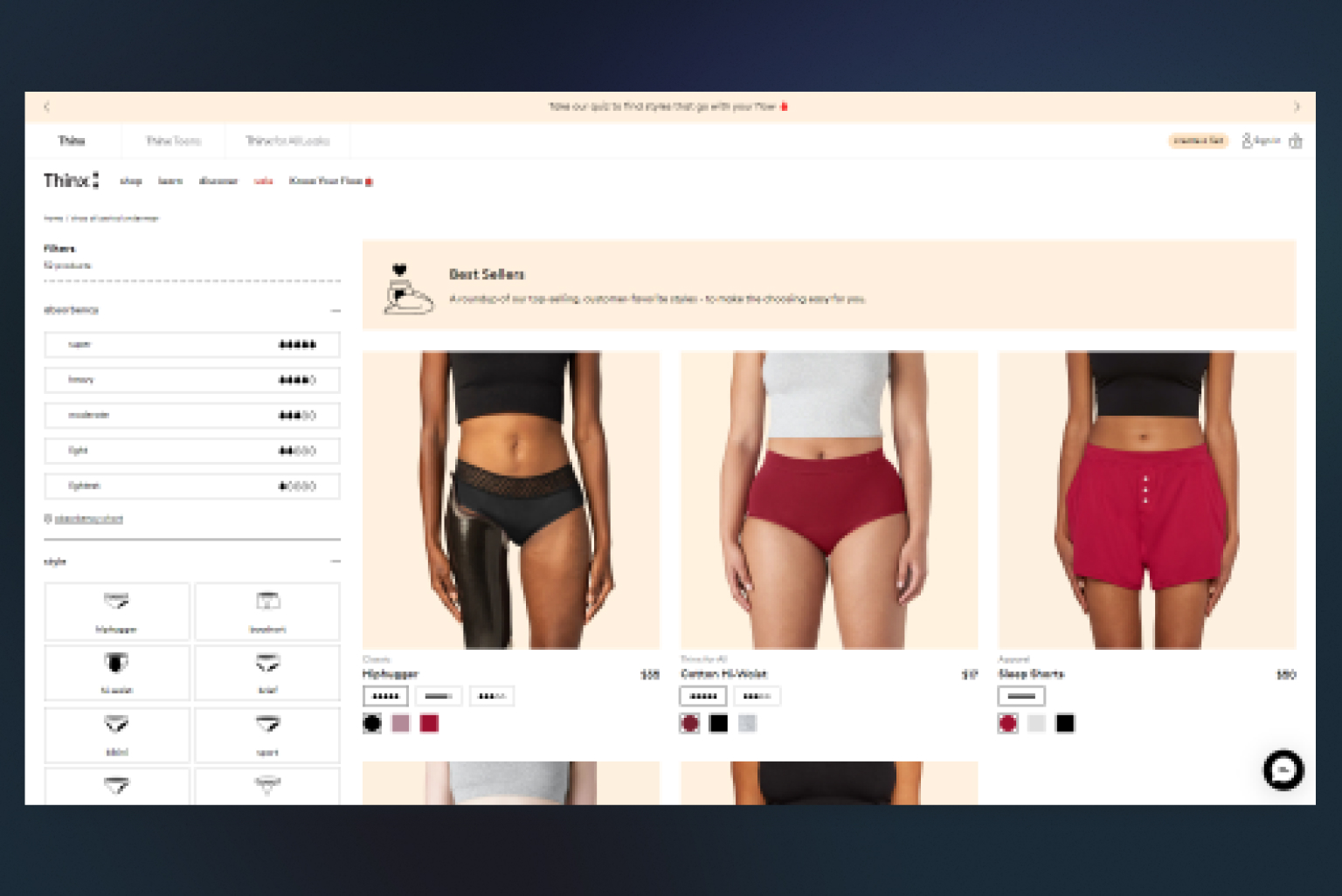
Make sure to showcase your top-selling products prominently on your eCommerce website. These could be the items that generate the highest sales, receive the best customer reviews, or contribute significantly to your revenue. By giving these products prime visibility, you increase the chances of attracting customer attention and boosting sales.
Implement attention-grabbing techniques such as using contrasting colors, adjusting the layout or image sizes, and creating eye-catching banners to promote your top products. Similar to building an attractive display or placing a product at eye-level in a physical store, directing users’ focus towards your desired top products can lead to increased sales and conversions.
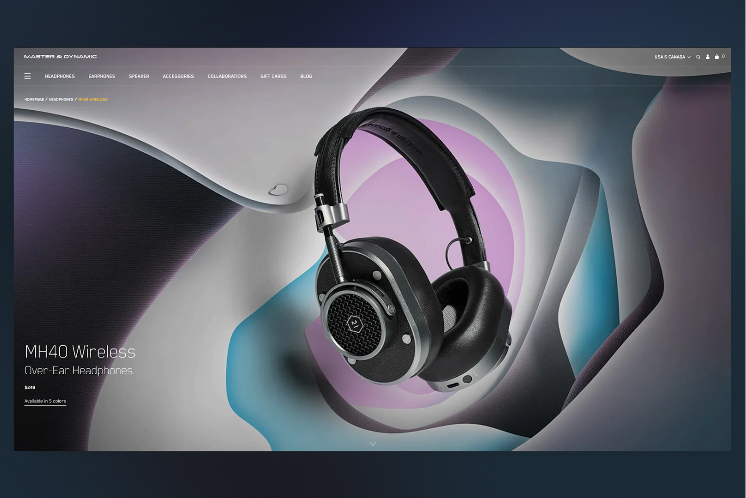
Tip #3. Use high-quality images
In the world of eCommerce, the impact of high-quality images cannot be overstated. When it comes to selling products online, visuals are vital in capturing the attention and interest of potential customers. Here’s why using high-quality images is essential for your eCommerce website:
Firstly, high-quality images have a captivating effect. Clear, sharp, and well-composed photographs create a professional and visually appealing experience for visitors. They help create a positive first impression of your brand, enticing users to explore your products further.
Secondly, high-quality images provide crucial product details. Customers heavily rely on visuals to assess the features, intricacies, and overall quality of a product. By presenting clear and detailed images, you enable shoppers to make informed purchasing decisions. This transparency builds trust and reduces the chances of customers being disappointed with their purchases.
Moreover, using high-quality images ensures consistency and reinforces your brand identity. Consistent image quality and style across your eCommerce website contribute to a cohesive brand image. When customers encounter consistent visuals, they associate it with professionalism, reliability, and a commitment to delivering high-quality products.
Lastly, optimizing images for mobile devices is crucial in today’s mobile-centric landscape. High-quality, properly optimized images guarantee a visually pleasing experience on smartphones and tablets. With more users browsing and shopping on mobile devices, this optimization is vital to ensure your products look appealing and enticing on smaller screens.
Tip #4. Ensure your content is scannable
Crafting lengthy descriptions for your eCommerce products may seem like a time-consuming task, but here’s a reality check: hardly anyone will read them. Studies indicate that the majority of website visitors only read around 20% of the text on a web page. Instead of reading word by word, they prefer to quickly scan the content, searching for essential information. To effectively communicate your message and drive sales, it’s crucial to make your content scannable.
To achieve this, break up your content, whether it’s product descriptions, blog posts, or an “about us” page, into easily scannable formats. Keep your sentences and paragraphs concise, use bolding techniques to emphasize key details, and employ bulleted lists to divide large blocks of text.
By making your content easy to scan, you increase the chances of your audience absorbing the essential information you want to convey. As a result, you enhance your ability to make sales and achieve your desired outcomes.
Tip #5. Prioritize branding
When it comes to online shopping, consumers prefer to buy from established brands rather than anonymous eCommerce websites that appear dubious. To establish trust and drive significant sales in your eCommerce business, it’s essential to prioritize branding. Your brand identity defines who you are as a company, your values, and what sets you apart from competitors. It plays a pivotal role in building a connection with your audience and ultimately driving sales.
To optimize your eCommerce design, invest time in defining your brand and seamlessly integrating it into your design. If you’re uncertain about your brand identity, take a moment for some introspection. Ask yourself questions like:
- If my brand were a person, who would it be?
- Can I describe my brand in three words?
- What distinguishes my brand from other eCommerce shops?
- What aspect of our business excels beyond competitors?
Once you have a clear understanding of your brand, infuse it into the branding elements of your eCommerce site. This consistent branding will foster trust with your audience, leading to increased sales and customer loyalty.
Remember, your branding is like the DNA of your eCommerce business. It defines your company’s essence and communicates its unique value proposition. By prioritizing branding and incorporating it into your eCommerce design, you can cultivate trust, resonate with your audience, and drive substantial sales.
Tip #6. Stick to user-centered approach
When creating an eCommerce website, it’s crucial to keep the user at the forefront of your design decisions. A user-centered approach ensures that your website is intuitive, engaging, and tailored to meet the needs and preferences of your target audience. By placing the user’s experience as a top priority, you create a seamless and enjoyable shopping journey, ultimately leading to increased conversions and customer satisfaction.
To adhere to a user-centered approach, focus on elements such as easy navigation, clear and concise product information, intuitive search functionality, and a streamlined checkout process. Pay attention to the visual design, ensuring it is visually appealing, consistent, and aligned with your brand identity. Incorporate user feedback, conduct usability tests, and analyze user behavior to continuously improve your website’s design and functionality.
By putting the user first, you build trust, foster loyalty, and encourage repeat visits. Satisfied customers are more likely to share positive experiences, recommend your website to others, and become brand advocates. In a competitive online landscape, a user-centered approach can be a key differentiator, setting your eCommerce website apart and positioning it as a go-to destination for a seamless and enjoyable shopping experience.
Tip #7. Make the “View Cart” button prominent
You may have observed that most eCommerce websites feature a small shopping cart icon, typically located in the top right corner of every page. This button serves a crucial purpose in eCommerce web design. It allows users to conveniently view the items they have added to their cart, offering a seamless shopping experience.
The presence of this button throughout a user’s online shopping journey has been proven to increase conversion rates. It is essential to ensure that the icon updates in real-time and features a recognizable symbol such as a shopping cart or shopping bag. Clarity is key, as confusing users should be avoided at all costs.
Given its significance, it is advisable to make the “View Cart” button visually stand out. Opt for a vibrant color that contrasts with the background, making it easily noticeable. Additionally, consider increasing the button’s size relative to other buttons on the website, making it the most easily identifiable element. By doing so, you can enhance the eCommerce experience for your customers and create a more efficient purchasing process.
Development Get a robust PWA
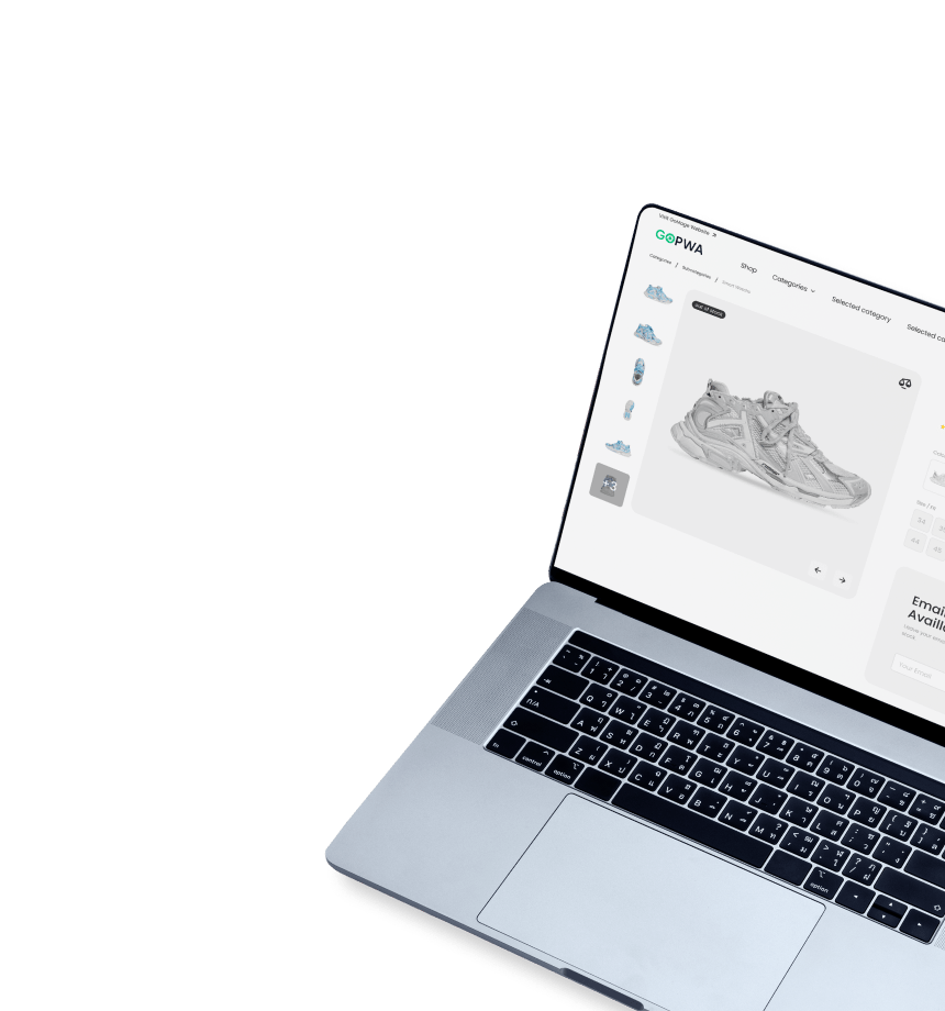
Supercharge your eCommerce efforts with superb UX and ‘superfast’ speed. Build an eCommerce PWA from scratch or save time and money using GoPWA Storefront.
Tip #8. Promote reviews & testimonials
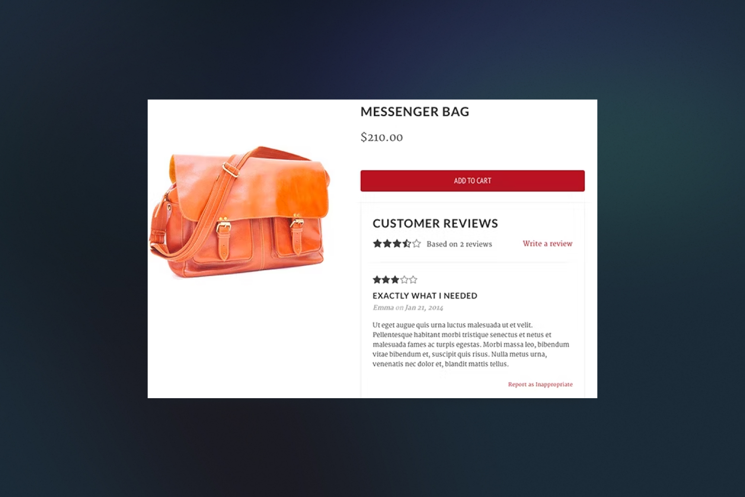
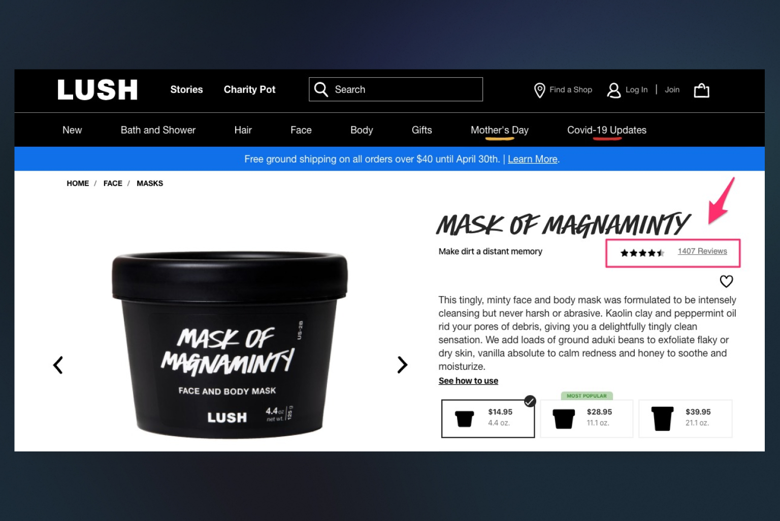
When designing an eCommerce website, it’s crucial to showcase customer reviews and testimonials. These social proofs play a significant role in building trust, credibility, and confidence among potential buyers. By prominently featuring reviews and testimonials, you create a sense of authenticity and encourage visitors to make purchasing decisions.
Integrate a dedicated section on your website where customers can leave reviews and ratings for products they have purchased. Display these reviews alongside the corresponding products, making it easy for potential buyers to access firsthand experiences and opinions. Additionally, consider including testimonials from satisfied customers on prominent pages of your website, such as the homepage or product category pages.
To further boost the impact of reviews and testimonials, incorporate star ratings, customer photos, or video testimonials whenever possible. These visual elements add authenticity and provide a more comprehensive understanding of the customer’s experience.
Make it easy for customers to leave reviews by implementing user-friendly review systems or integrating with popular review platforms. Responding to customer reviews, both positive and negative, demonstrates your commitment to customer satisfaction and showcases your responsiveness.
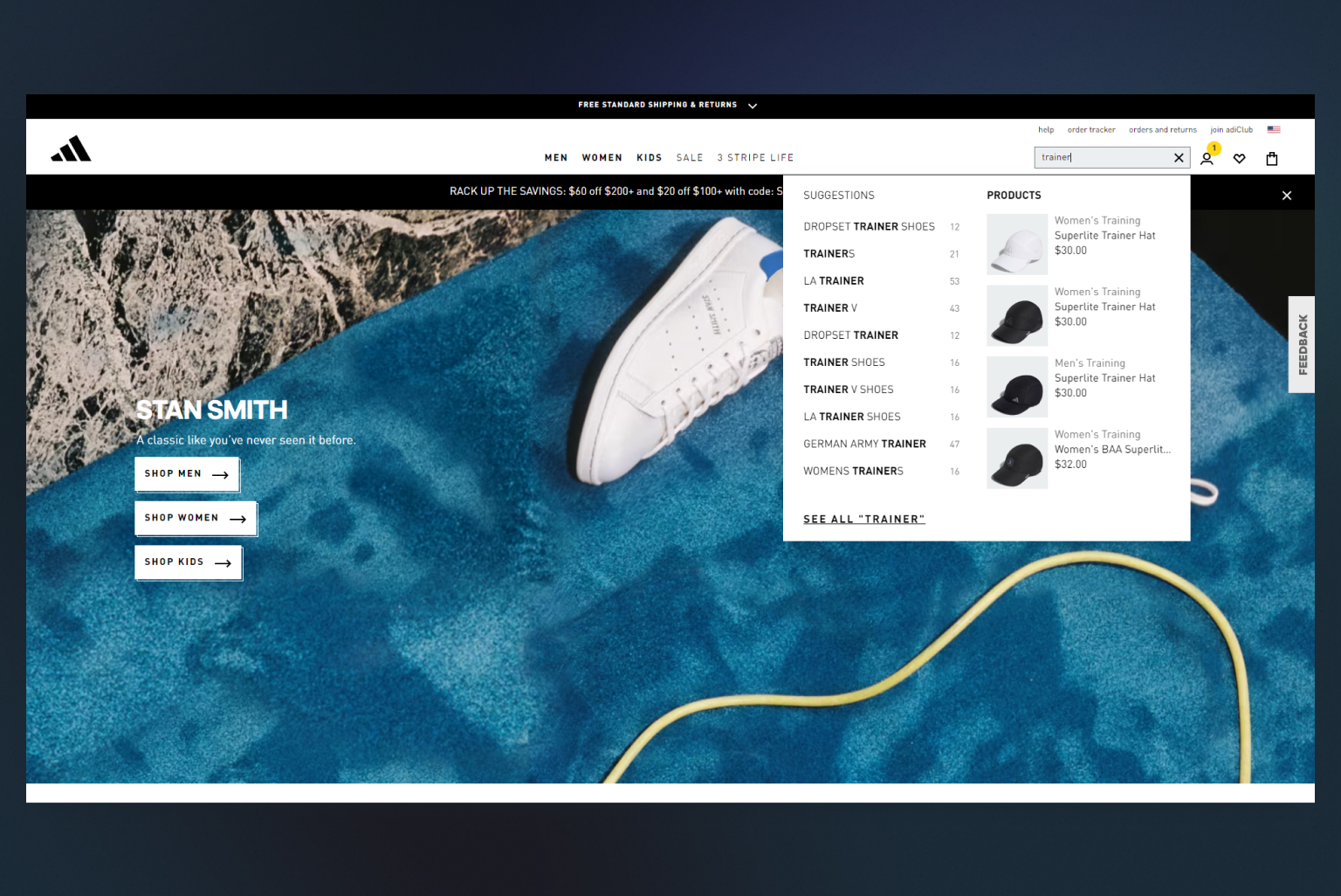
Tip #9. Incorporate a search bar
A significant portion of your website visitors will enter your site with a specific product in mind. By including a visible search bar, you enable them to easily locate their desired product without the need to navigate through extensive pages of unrelated information that they aren’t interested in.
If users cannot quickly find a way to search for a specific product on your site, they are more likely to seek alternative sources. Therefore, it is essential to position your search bar prominently, typically near the top of your website, often in the right-hand corner. This strategic placement ensures that the search bar is easily visible and accessible, facilitating a quick and seamless search experience for your visitors.
Tip #10. Let customers filter products
When designing your eCommerce website, one crucial feature that can significantly enhance the shopping experience is implementing product filtering options. Allowing customers to filter products based on specific criteria empowers them to find exactly what they’re looking for quickly and efficiently.
To implement product filtering effectively:
- Identify key attributes
Determine the essential product attributes that customers are likely to filter. Consider factors such as product category, price, size, color, brand, and any other relevant features specific to your products.
- Offer a user-friendly interface
Design a user-friendly interface that clearly presents filtering options. Use checkboxes, drop-down menus, sliders, or other intuitive elements that make it easy for customers to select their desired filters.
- Provide seamless integration
Ensure that the filtering system seamlessly integrates with your website’s search functionality. As customers select filters, the search results should dynamically update to display products that match the selected criteria.
- Offer clear filtering options
Clearly label and categorize the available filtering options. Make it easy for customers to understand and select the filters that are most relevant to their search.
By implementing product filtering options, you enhance the overall user experience, increase the chances of customers finding their desired products, and ultimately drive conversions. By providing customers with the ability to refine their search results, you empower them to make informed purchasing decisions, leading to greater customer satisfaction and repeat business.
Final thoughts
Designing an exceptional eCommerce website is a dynamic and ever-evolving process. With the valuable tips and strategies covered in this article, you now know how to design an eCommerce website that’s visually appealing, user-friendly, and conversion-focused. With a well-designed eCommerce website, you can establish a strong online presence, increase customer satisfaction, and ultimately achieve your business goals in the competitive world of online retail.
