According to the reports, about 60% of online shoppers will go away from your online store even if they are ready to buy and have enough money for the purchase.
In 2014 the abandoned carts contained orders to the amount of four trillion dollars.
However, we should agree that some people naturally go away and don’t complete one step checkout processes. There are many reasons to this fact.
People don’t know what they really need or don’t confident in their decision and they are afraid of making mistakes. It is a reality of e-commerce that you can’t present the product physically and the best images from different angles and even video can’t replace perception of the product like in a regular store.
If the product is expansive or complex and needs some skills for using it the choosing phase can be very stressful. Despite this, many online merchants make the same blunders especially during the one step checkout phase and lose customers.
Why Buyers Abandon Carts During One Page Checkout
Advertising. Searching and choosing can be very exhausting. That is why you can make a mistake if at the last step you show extra information as advertising messages or banners with other attractive products. In this case, you risk that your potential customer will go back to searching elsewhere.
Polls and Questions. During checkout it is not the right place for asking about feedbacks or some marketing questions as “Where did you find the information about us?” Don’t disturb your potential customers with questions which are not related to their purchase.
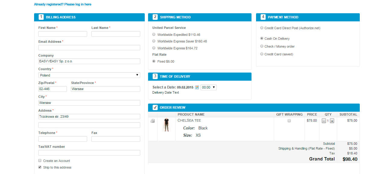
Creating an Account. If it is a mandatory procedure on one step checkout, you risk losing your client because usually the account creating includes several steps and many fields for filling out. Then your client needs to check their e-mail to confirm registration. Such extra work and distractions can increase the percentage of abandon carts.
There should be only one distinction between new and returning shoppers. The first ones need to specify an email with a password to finish the checkout process. When the payment is completed, it is the right time to ask for creating an account.
People prefer not to give personal information that is why you need to motivate your clients to do this. And of course, the information from the checkout process has to be used to make this procedure easier.
Auto-fill Fields. Plan each step on one-page checkout carefully. For example, if the postal code is entered first the location place can be identified automatically.
In most situations, shipping (delivery) and billing addresses are similar. You can configure your one-page checkout extension to fill out the field of shipping address automatically after billing address or provide to the customer a special button for doing this operation.
The gross blunder is an unexpected extra cost
Your customer tries something interesting, likes it and is ready to pay. And only here he/she discovers that the delivery service costs extra money. It is the huge mistake. If delivery service is not free, the real costs must be shown to the customer in the searching process.
Don’t keep a secret about additional costs that are not added to the products’ price. If the logistics department is overloaded, for example, during the holidays, inform about the real time and the real costs for delivery at the searching phase but not on one-page checkout process.
A Hint About Better Offer is a Blunder as Well
If you suggest special prices for some special buyers you can push away others who have no rights to these offers. These potential customers will go away to look for a better price on other sites. Better to remove these fields from default settings and make them visible only to certain users of your online store.
Payment Methods
It is a big disappointment when a customer wants to buy, but can’t because there is no way to pay. Strict requirement – all popular methods of payment should be supported by your online store. But it is not enough. Customers will leave the checkout page if payment fees are higher than common or usual fees or higher than they expect.
One Step Checkout for Mobile Version
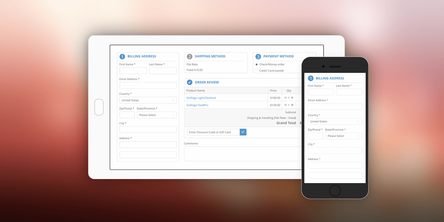
Mobile devices make a big part of our life and they will become more and more popular in the future. Meet this requirement and optimize your online store and one step checkout flow to the mobile devices.
Our Solution
We hope that our recommendations will be useful for you. GoMage LightCheckout: One Page Checkout for Magento ® was developed more than five years ago and it was one of the first extensions we provide to the e-commerce market. It is still popular because the best e-commerce practice which allows retaining clients are implemented in the extension.


