Every solution starts with a design.
Progressive web app design is about much more than just a nice picture.
It’s about knowing the principles of PWA design and the difference between responsive web design vs. progressive web app.
When you design a PWA, you create a perception of your brand among customers. After all, 50% of users say that website design is crucial in forming an opinion about a brand.
The failure to provide a nice-looking and user-friendly PWA design will lead to high abandonment rates and low conversions.
This article will help you better understand what it takes to design a PWA and what problems you can encounter on the road.
This article sheds light on UX and UI PWA design:
- Why invest in PWA design
- Two areas of focus when designing PWAs
- Best UX/UI PWA design patterns
- Tips to create an outstanding PWA design
Continue exploring the article for actionable PWA design guidelines and steps.
Development Get a robust PWA
Supercharge your eCommerce efforts with superb UX and ‘superfast’ speed. Build an eCommerce PWA from scratch or save time and money using GoPWA Storefront.
Why Should You Care About PWA Design?
A number of factors influence the success of an eCommerce business.
Design plays a huge role in forming customers’ perception of your brand and business.
That’s why investments in a PWA design when building a progressive web app will pay off in the future.
Let’s find out what different researches tell about design and its influence on businesses:
- Internet traffic is growing. In 2021, over half of the world’s internet traffic came from mobile devices and tablets. Having a solid business presence on mobile has never been so crucial.
- It takes only 50 milliseconds for users to form an opinion about a website and the business – Design and speed influence their opinion. Thankfully, PWAs solve half the task by providing great speed, and you need to take care of PWA design only.
- Even if your PWA loads faster, customers will still evaluate it based on the visual progressive web app design.94% of first impressions on the web are design related. If you fail to provide a custom PWA design, you’ll lose your chance to have a great brand impression on customers.
That’s why it’s so important to get everything sorted out when it comes to PWA design.
PWA Design Guidelines: Three Areas of Focus
Progressive web applications are cross-platform and allow creating a separate design for different versions:
- Web version when customers use your PWA as a traditional website. You can build the web version using the best principles of custom eCommerce web design. If you already have a website on Magento and want to turn it into a PWA, you can hire Magento web designers to adjust the existing theme and design to the new PWA-powered storefront.
- Desktop version if customers add your PWA to their computer or laptop. With the desktop version, you have more screen size to place more elements, such as more spaces, additional photos, etc.
- Mobile version, which should be your priority. The mobile version of the PWA will be quite different from your web and desktop versions. Usually, the PWA contains only the most critical features of the storefront that allow customers to choose products, place orders, and make payments easily. Before you get started, you need to understand the differences between progressive web apps vs mobile apps and how to design PWA to maximize their potential. You’ll learn that in the following chapters of the article, so continue reading.
Best Practices for Progressive Web App Design
The PWA design consists of User Experience (UX) and User Interface (UI) design. While both concepts refer to design, they concentrate on different aspects.
User experience design refers to the experience a user has when interacting with a PWA. UX designers create user flows and make sure your application is easy to use and intuitive to end-users.
User interface design refers to the visual part of the PWA design and everything users see when they open the app. UI designers create the look, feel, and interactivity of a PWA. UI is the first thing visitors see when they land on your PWA.
Designing a PWA has much more in common with designing native apps, and you need to keep this in mind. This article will help you avoid pitfalls that companies redesigning their websites for mobile usually fall into.
Below you can find recommendations for the UX and UI parts of progressive web apps design.
UX PWA Design
Let’s look at some techniques that won’t allow you to mess up your UX design and ensure smooth interaction of users with your PWA.
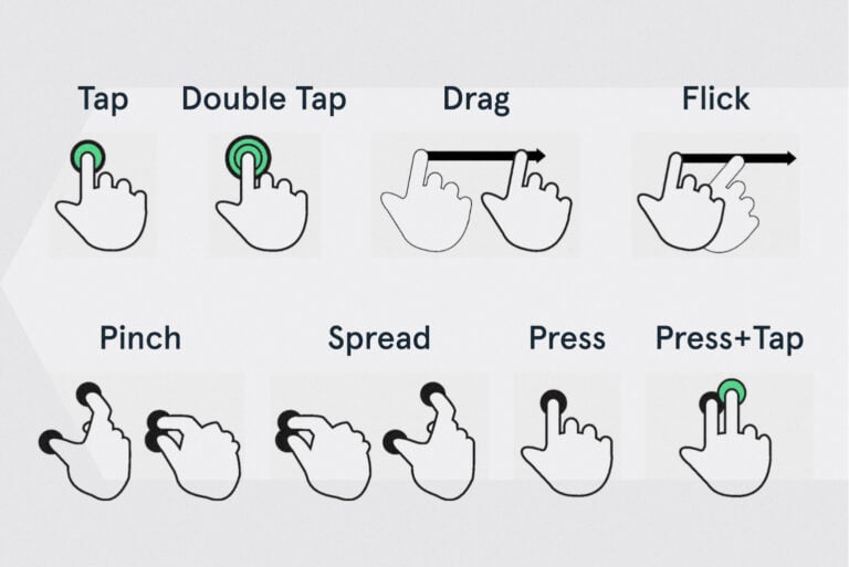
Predictable gestures
From a user’s perspective, progressive web apps are no different from native websites. PWA design should be approached just like a native application design. They expect the same gestures to be functional after adding a PWA to their mobile device’s home screen.
Make sure you don’t try to reinvent the wheel, and your storefront uses familiar gestures, such as swipes, taps, and scrolls. The last thing any eCommerce business wants is for users to wander through an online store, figuring out how to make a purchase. In most cases, they’ll just leave the app without placing an order.
Simple navigation
When it comes to navigation, you need to use the KISS principle – Keep It Simple, Stupid.
Mobile apps are much smaller than desktop apps. Comparing the screen sizes will help you understand the difference – 3-5 diagonal inches vs. 20-30 inches. Also, a smartphone’s processing power is lower than a desktop’s.
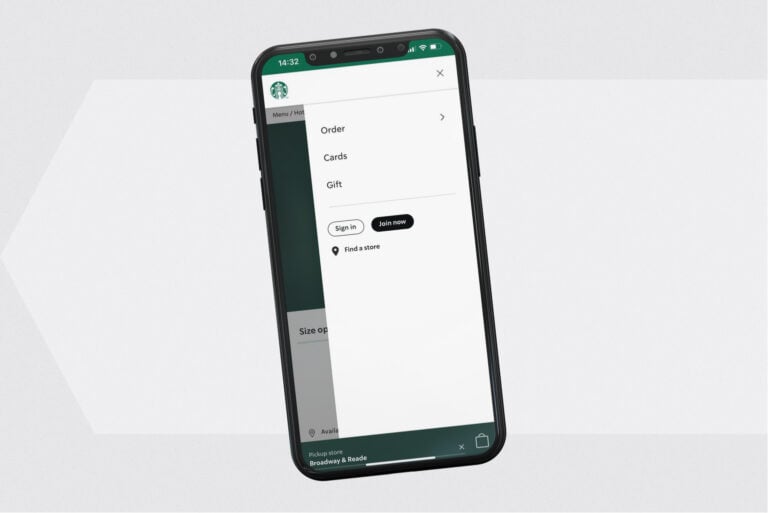
An eCommerce PWA is not a place to try and impress users with intricate layouts and complex designs. Make it as simple as possible. Mobile apps usually have less content compared to websites. It’s also a good practice to remove the footer and use an on-screen navigation bar at the bottom of the screen, which shouldn’t eat up too much space.
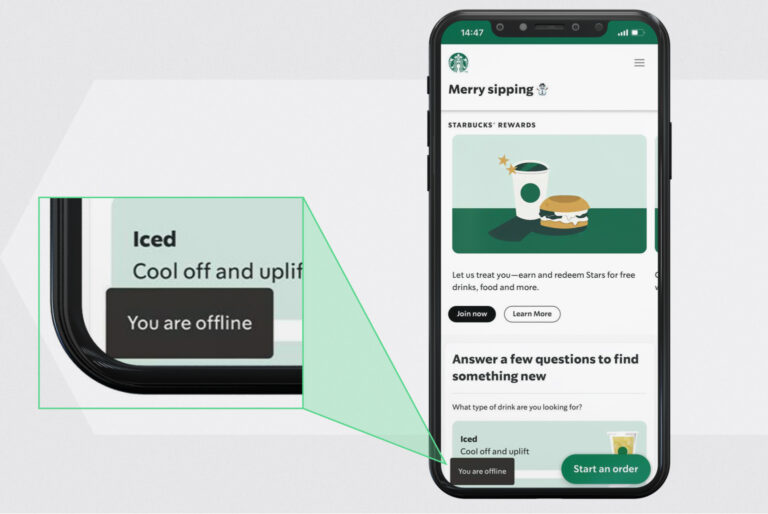
A great example is the Starbucks PWA with the main menu that provides three options – Menu, Rewards, Gift Cards. Thanks to the limited number of options, it gives a focused customer experience optimized for mobile ordering.
After you release a PWA, it’s time to analyze the UX design and see what elements have low user engagement. If any are detected, you can redesign them or remove them altogether.
Back button
Keep in mind that not all Android smartphones and no iPhones have a physical back button. When users add a PWA to the home screen, there won’t be a browser back button.
If you want your PWA to be displayed in fullscreen mode on mobile devices, you need to add a back button to the user flow.
Onboarding
Consider adding onboarding to make the user experience for customers as smooth as possible. It shouldn’t be long and show features that users might not be familiar with. A skip option is a must-have if you don’t want to lose users if they prefer getting right to shopping.
Offline user engagement
Offline mode is the key feature that sets PWAs aside from websites. When users go offline, they can still use some functionality or even all the features of a PWA. Still, if a customer hasn’t visited some pages of your online store, they won’t be cached, and customers won’t be able to load.
Depending on what functionality won’t work offline, you need to decide what users will see if they land on the previously non-cached page, what content will be served and how customers will be able to interact with it.
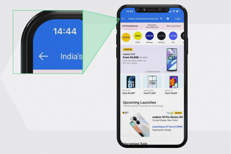
Also, you can notify customers that they are offline. For example, Flipkart makes their PWA black-and-white when there is no internet connection and Starbucks shows a message telling users they are offline.
Make interactions smooth
Performance and speed are two factors that also influence the customer experience. We’ll talk about them later and now let’s focus on how to make the interaction with your PWA as smooth as possible.
When there is a redirection to a new page, and loading takes too long, users may leave your PWA thinking it’s stopped performing. Providing transition states is what can make them wait longer. You can show a skeleton UI when content is loading. The skeleton of the UI provides a preview of the new page and shows to customers that your PWA is still working.
Use push notifications sparsely
Push notifications are a great tool to re-engage customers. However, they should be used with caution.
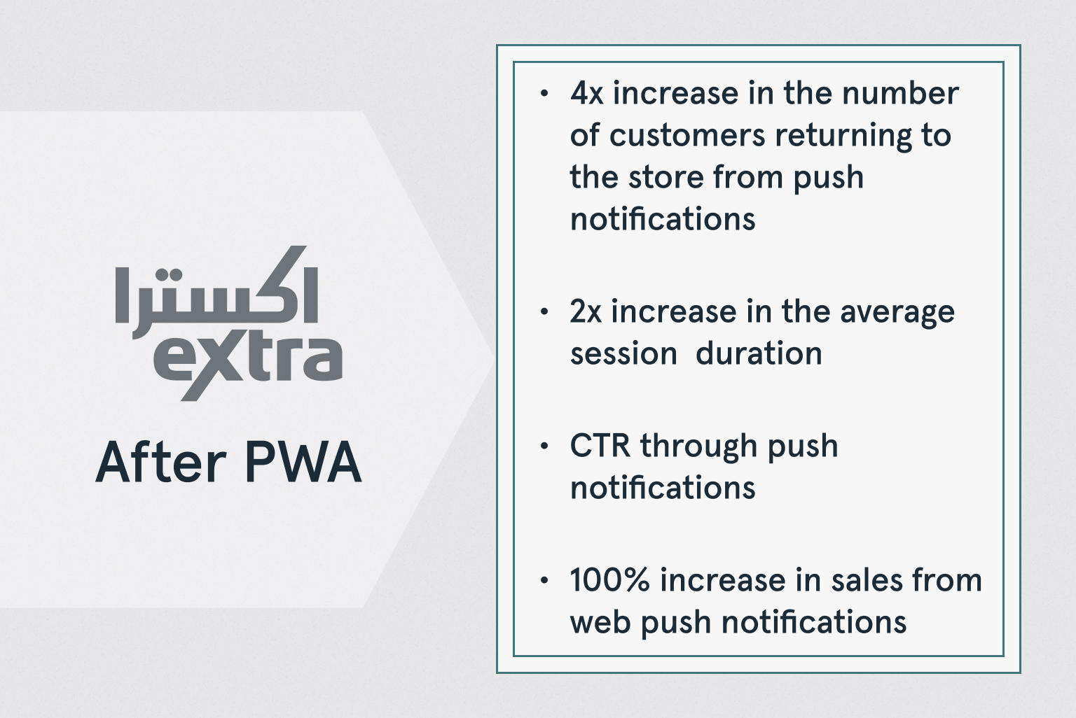
On average, PWA users are more likely to opt into receiving push notifications than website visitors. Sometimes, businesses are so eager to use this tool to engage customers that they forget about user experience and start bombarding them with push notifications. The only thing they achieve is annoying customers who delete the PWA from their devices.
Below you can see the results that businesses get with PWAs.
Here’re a few basic principles of reasonable push notification usage:
- First, provide value, then ask permission to send notifications. Don’t interrupt visitors as soon as they open your PWA. Let them roam your PWA for a while and get better acquainted with your brand.
- Keep notifications short. You only have between 35-42 characters to convince customers to unlock their smartphone and click on the notifications. You better use this chance wisely.
- Personalize notifications to make them more relevant to users and increase the CTR. They can remind customers about abandoned carts, tell them about upcoming sales, or new products in your store.
Reduce friction
There is no doubt that a PWA should load fast. But what is the real value of fast performance if users need to go through a long and complicated shopping process?
Average cart abandonment rate is around 70%. That means that every 7 out of 10 shoppers don’t complete their transaction. Too long and complicated the checkout process might be one of the reasons.
As a part of providing a smooth user experience, consider adding the autofill option to the checkout and a number of payment options. This way, costumes won’t need to add the payment details manually and will be able to fill out details quickly. Such a feature reduces friction and helps customers place orders faster. The result is lower cart abandonment rates and better customer experience.
After you’ve released a PWA, do a regular audit of all PWA pages, identify and eliminate spots of friction. Such spots may include long and complicated processes, errors, poor readability, some questions, etc.
UI PWA Design
It’s time to look at the best principles of working on the UI of a progressive web application – the first thing users see when they enter your PWA.
Simple fonts
PWAs should be designed with performance in mind. Custom fonts take time to load, which leads to longer PWA loading times.
The best solution is to use simple fonts in PWA design, which helps decrease load time. You can also set up a PWA to use the device’s default fonts. If you need to use some custom font, don’t use them when customers enter your PWA for the first time. By using them on subsequent loads, you’ll make their experience faster.
Emphasize the ‘Add to Homescreen’ prompt
When customers enter your store through a browser, one of your goals is to persuade them to install the PWA on their smartphones. The ‘Add to Homescreen’ button should draw the attention of users. As not everyone is familiar with the PWA technology, users might not even have a suspicion that they are using a PWA and can install it on their devices. You need to tell them about such an option loud and clear, and highlighting the ‘Add to Homescreen’ button in the PWA design is the way to do that.
Show interaction
PWA on mobile devices should act like native applications. That’s why it’s important to show interaction when users tap some element, such as a button, menu section, etc. This way, customers will see the feedback on their actions and double-click and trigger a wrong action by mistake.
Custom splash screen
Progressive web apps support the use of splash screens. A splash screen, also known as a boot or launch screen, is displayed for 2-3 seconds while the application loads. It’s a great way to show users that something is happening and the application is being loaded, especially if they’re on a slow internet connection.
Businesses can show their logo, company’s name, or an animation on the splash screen to increase brand visibility and keep customers engaged.
Attractive home screen logo
After users have added your PWA to their home screen, they’d see its logo there. As a part of PWA design, you need to create an attractive logo that will catch customers’ attention every time they look at their smartphone’s home screen.
Make a native-like PWA design
Users expect a PWA to be no different from native apps. The PWA experience on a mobile device should feel like a native app.
When designing the mobile version of your PWA, rely on the best principles of native design and use the elements that customers are already familiar with. Use Material Design Guidelines by Google and Human Interface Guidelines by Apple to better understand what it takes to design a PWA with a native-like experience.
Tell about deletion consequences
When customers decide to delete your PWA from their mobile devices, they don’t always understand how it’ll impact their experience.
Make sure to show a message telling them how it’ll impact the usage of a PWA, especially if a customer hasn’t created an account with your store. In this case, all the saved data will be lost and, if customers have placed some items in their shopping cart, they won’t be able to continue shopping on the web version of your store.
Extra Tips to Create a Great PWA Design
Progressive web app design doesn’t come down to a fancy look. There are a lot of things that are not visible to customers but impact their buying decisions. Let’s see what else you can do to design a PWA with high conversion rates.
Know your audience
Explore the target audience before you start working on the PWA design.
- Who is your audience?
- What do they care about?
- What pain points do they have?
- How can your store address those pains?
- What does impact their buying decision?
These are just a few questions you need to answer before starting with a progressive web app design.
Explore the latest trends
If you’re exploring PWA technology, you’re probably one of the people who don’t live in the past and prefer riding the wave with the latest solutions.
But to be clear, designing a PWA once and letting it go is not the way to the best eCommerce results. Make sure you keep track of the latest trends in the industry and update your store accordingly. While a bit dated look might seem cute to some, it may scare away many potential customers.
Also, regularly analyze the performance of your eCommerce store and make changes to PWA design to maximize profits.
Provide great speed
Users usually wait less than 3 seconds for a website to load before leaving it for competition. What is the point of a great PWA design if users won’t even see it?
On average, PWAs deliver 2 to 4 times faster page speed. Compared to the previous mobile website, PWAs can improve website performance by up to 63%.
But to get their results, you need to make a well-informed decision and choose a PWA storefront that won’t jeopardize your efforts.
Our PWA storefront – GOPWA – loads faster than a standard Magento 2 or Adobe Commerce out of the box thanks to up to 10 times less GraphQL requests to the server. If you have a slow website, GOPWA can help you solve the issue.

