Sellbery
Sellbery is a solution for eCommerce sellers designed to help them become part of the global market by simplifying and optimizing the way they sell.
Passenger:
SellberyLocation:
USADestination:
A redesigned website with better usability, higher conversions, and recognized brand identityFlight time:
March 2021 — October 2021Crew:
Head of Growth Marketing, UX and UI/Animation Designer, WordPress Developer, 3 Copywriters, Data Analyst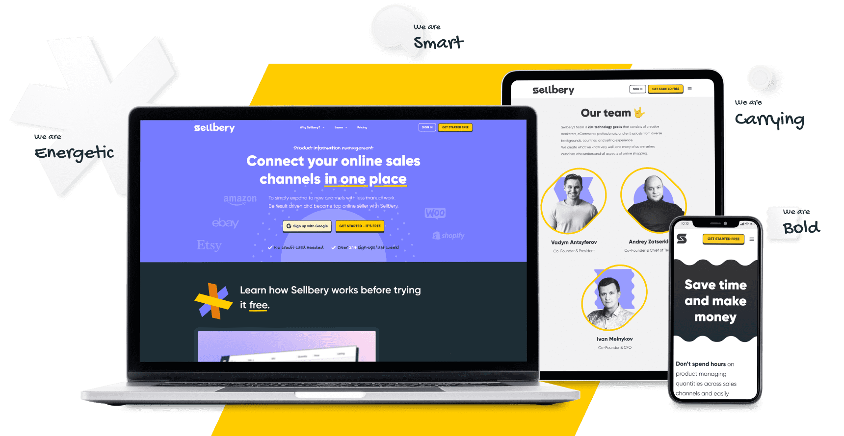
The Flight
with Sellbery.
Sellbery is a product information management (PIM) software designed to help eCommerce sellers to manage their multiple popular marketplaces in one place.
With Sellbery, merchants can easily manage their multiple marketplaces like Amazon, eBay, Etsy, Shopify and WooCommerce from a single platform.
The product helps get rid of immense manual work, thus having a chance to increase sales and grow profits.
Arrivals
Increase in conversionsIt’s GOMAGE’s sister brand. As soon as both brands are eCommerce-focused, we understood all the aspects of online shopping well.
Sellbery 1.0 wasn’t fulfilling sellers’ expectations to the fullest. Some people were frustrated with their experience. Also, Sellbery restructured their business model from a sales-led to a self-service product-led platform.
These were the key reasons for Sellbery to make changes in order to bring something exceptional to their clients, and to reflect those changes in their new design.
Flying to similar destinations?
Let’s have a chat!
Web Design
before & after.


Customer interviews
We wanted to learn the ins and outs of how the competition works and what potential clients expect from Sellbery.
Competitive analysis
We had no funnels or user flows set up to analyze what worked well and what didn’t. There were no clearly defined goals Sellbery wanted to achieve. And that was a huge challenge. So the only way was to rely on the ICP and conduct customer interviews.
What Sellbery got?
We collected all possible data to develop a go-to-market strategy for the USA market, rethink the brand’s mission and vision, and craft the positioning that will resonate with potential clients and make us stand out in the competition arena.
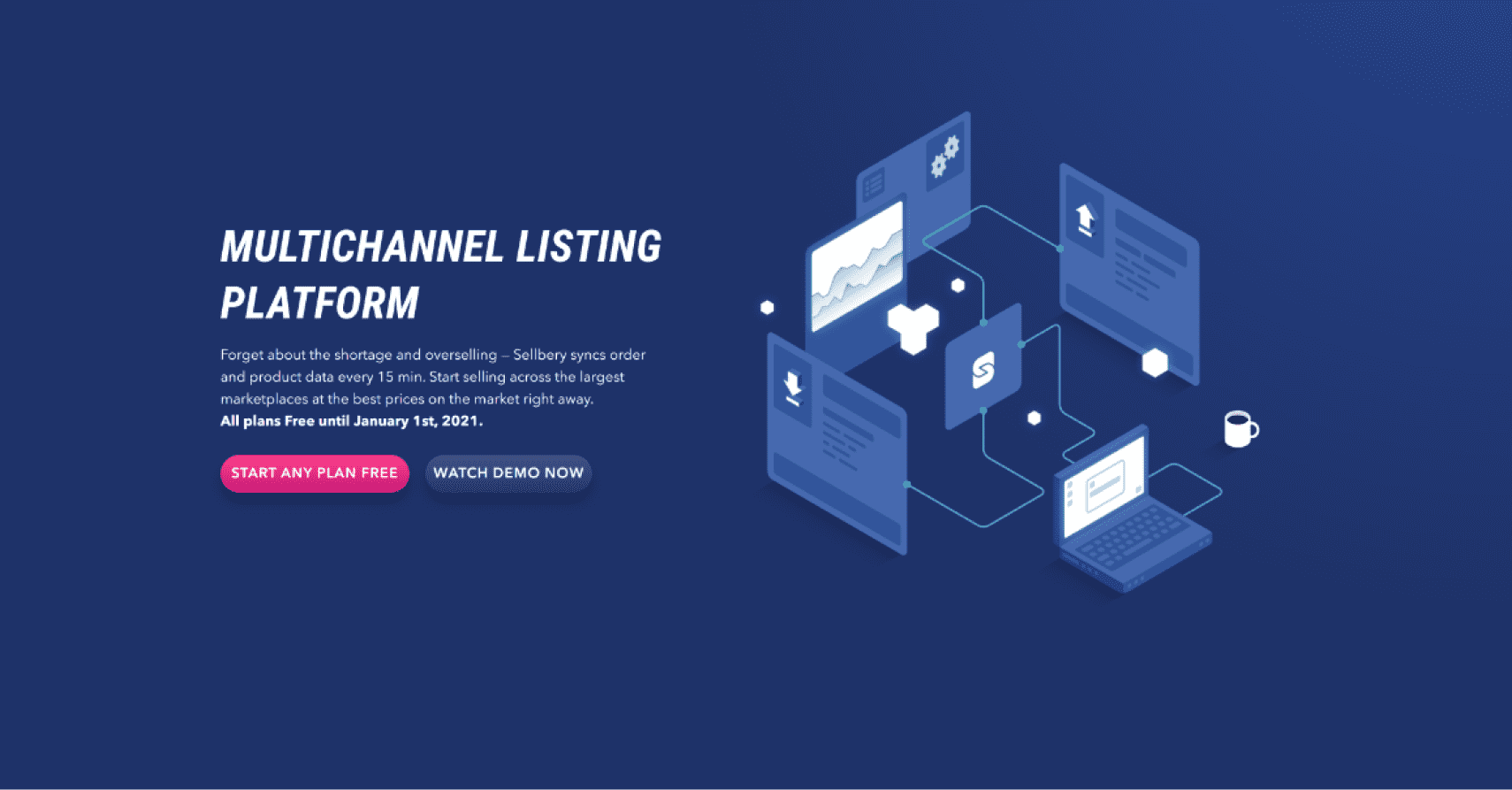 Old
Old
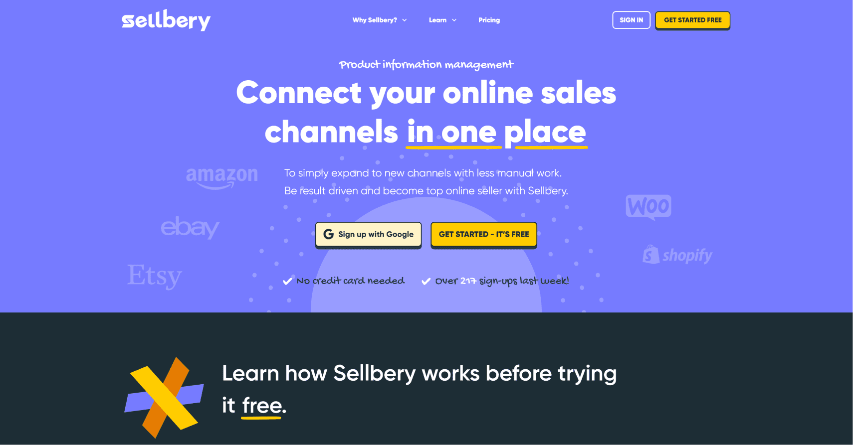 New
New
STAGE: redesign
Why redesign?
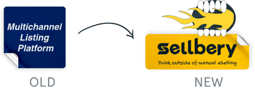
The old design was done in the monotone navy blue color. Typically, this color communicates trust and stability. However, it’s less attention-seeking. And this didn’t align with how Sellbery wanted people to feel about their brand.
Lack of contrasting elements that could catch the eye along with poor UX design and unclear positioning impacted conversions badly.
Modernized
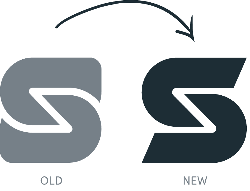
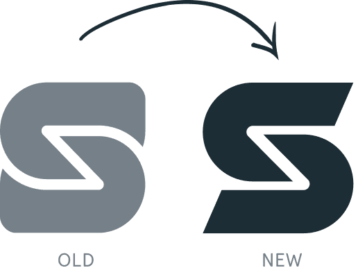
Logo.
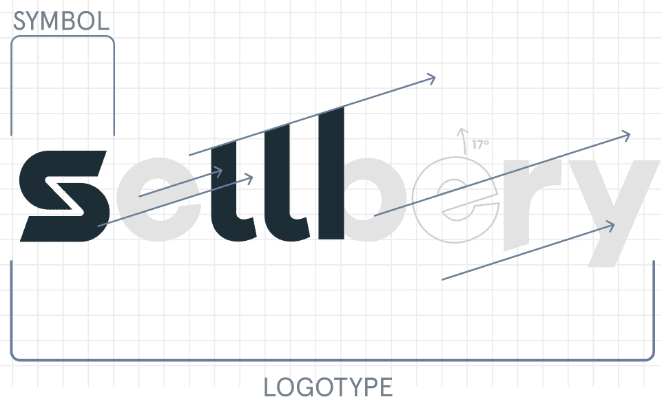
Sellbery’s old full logo featured the hand-drawn “S” to make it distinct, and the rest of the letters were written in Gillroy font. For the new logo, we opted for a sharp yellow color. The “S” remained hand-drawn to communicate minimalism along with friendliness and cheer.
Giving growth
to the Brand.
The brand name was crafted to be associated with selling online to immediately gain the target audience’s attention. It wasn’t meant to directly promise increased sales. Instead, it promised to get sales growth opportunities through optimizing the way merchants sell. Thus, the redesigned name features an ascending line implying an increase in sales and the growth of your profit in the long run.
Reposition to stick.
Sellbery’s slogan is “Think Outside of Manual eSelling”, which implies selling in a smarter way through automating time-consuming and error-prone manual tasks from a single dashboard. Best results can only be achieved by thinking unconventionally and approaching things differently. By optimizing their processes, merchants gain more while putting less effort into it. This is the idea behind Sellbery.

GoMage continues working together with Sellbery, making their websites even more powerful.
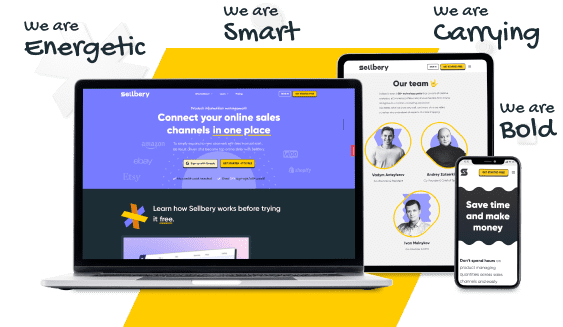
As a result, Sellbery got a redesigned website that now helps customers feel more confident about using the product as well as welcomes them with an excellent look. The transformation led to increased conversions, the growth of paid clients base, and boosting Sellbery’s reputation.



Looking for rebranding?
Get in touch!
Please fill out the following quick questions so I can get in touch with you.
Stage: UX/UI Design
Colors that vibrate friendliness.
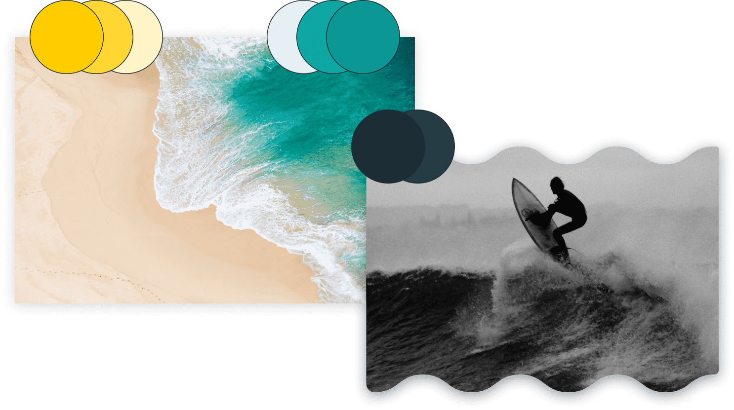
Sellbery’s new brand colors — calm and peaceful — were meant to radiate a warm and comforting energy and show the care about customers’ frustrations and problems. The aim was to uplift the energy of website visitors and give them a sense of stability and serenity.
Playfulness
in the styles.
Sellbery chose a new font for communicating their messaging — Gillroy. It’s simple to read and comes in a variety of designs. Gillroy has a sleek appearance and goes well with Sellbery’s theme and color palette.
The pictures used throughout the site were intended to create a sense of trust as well as to uplift the mood with an easy-going vibe.

Rebranding in
Numbers
The goal was to make the website look great and easy to use at the same time with the best CRO practices in mind.
